A Doctor Writes: Chris Whitty’s Slide Show Yesterday Was a Blatant Exercise in Biased Data Selection
Wed 9:32 am +01:00, 16 Jun 2021
The following is a guest post from Lockdown Sceptics’ in-house doctor, formerly a senior medic in the NHS.
In early November, Patrick Vallance and Chris Whitty were summoned before the House of Commons Science and Technology Committee and questioned about their presentation of data to justify a second lockdown. Following their appearance, the government was obliged to ‘correct’ a number of misleading graphics which portrayed the situation as being far more serious than it actually was. The Government was officially criticised by the U.K. statistics watchdog for the misleading presentation.
After last night’s Downing Street press conference I expect Greg Clark, the Committee Chair, will be scheduling a repeat appointment.
Professor Whitty’s presentation was a blatant example of data selection. At the risk of image overload, I will run through a few points he made and quite a few more that he somehow overlooked. This is by no means a comprehensive critique – to be frank, I don’t have time and I doubt the readers have the patience to go through all the egregious errors and data manipulation that went on last night. We will have to leave that to the Science and Technology Committee.
Let’s start with hospital admissions. The official slides measure admissions per 100K population. Here it is, showing an alarming rise in admissions in the North West of England in Graph One.
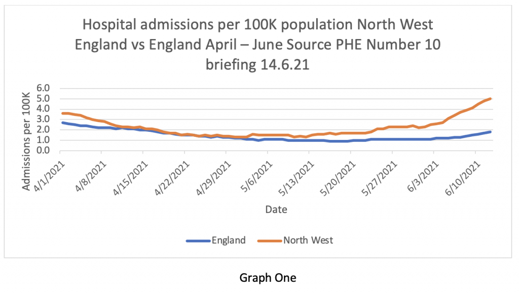
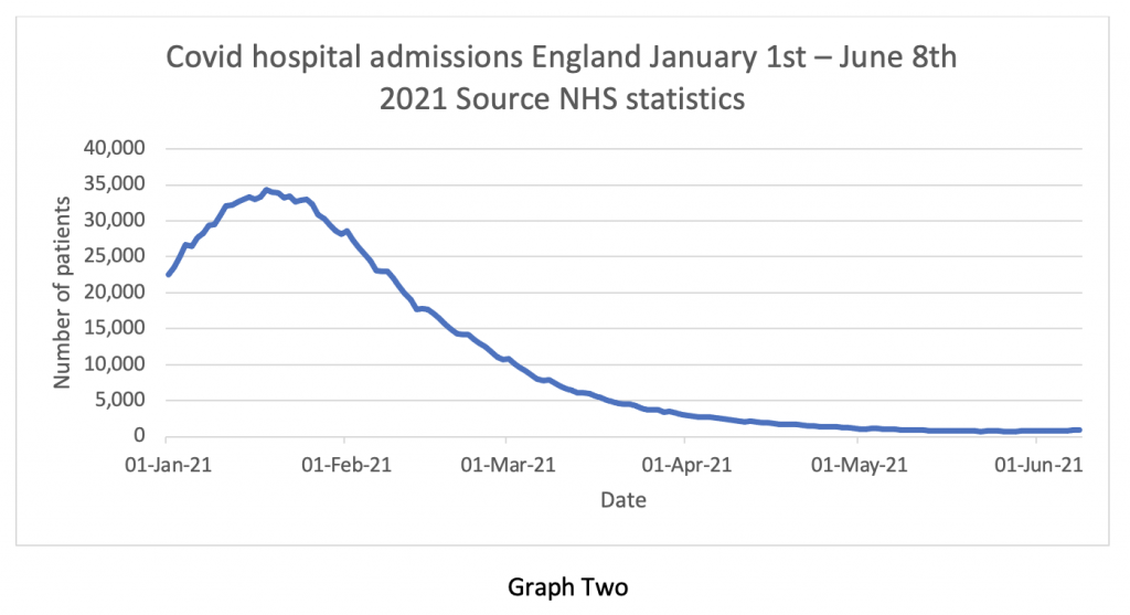
But Graph Two puts that ‘alarming rise in admissions’ into context – it’s so tiny one can’t actually see it. This is a classic statistical trick – altering the ‘y axis’ scale to imply a greater increase and altering the ‘x axis’ only to show the bit of data that supports the hypothesis and deliberately to exclude data points that refute it. For some reason, the following contextual graphic didn’t make it into the briefing pack.
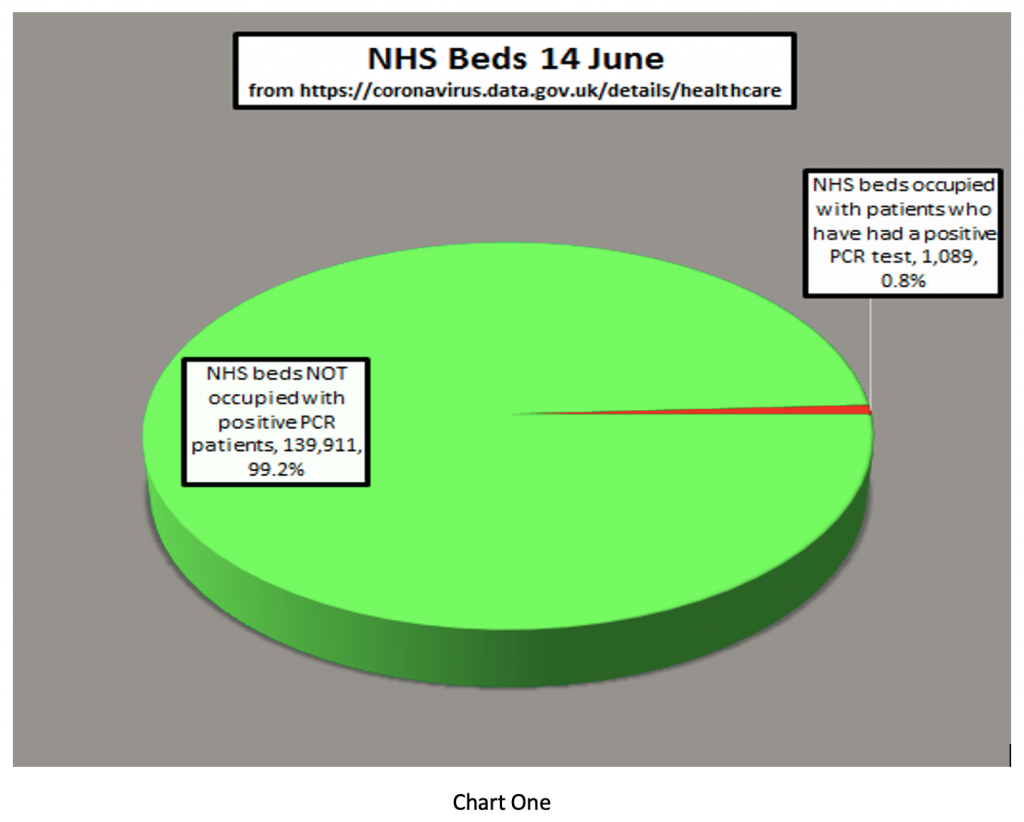
Next, the Prime Minister said that “the doubling of patients being hospitalised is very concerning for the Government”. It isn’t clear to me where he got the information that the number of patients being hospitalised has doubled – I can’t find it anywhere. I wonder whether number 10 might find Chart One useful. It shows the number of COVID patients in hospital vs the total NHS inpatient load. At present, less than 1% of inpatients are NHS beds are occupied by patients who’ve tested positive for COVID-19. In fact, there are 1079 patients and 1257 hospitals – we literally have more hospitals than patients.
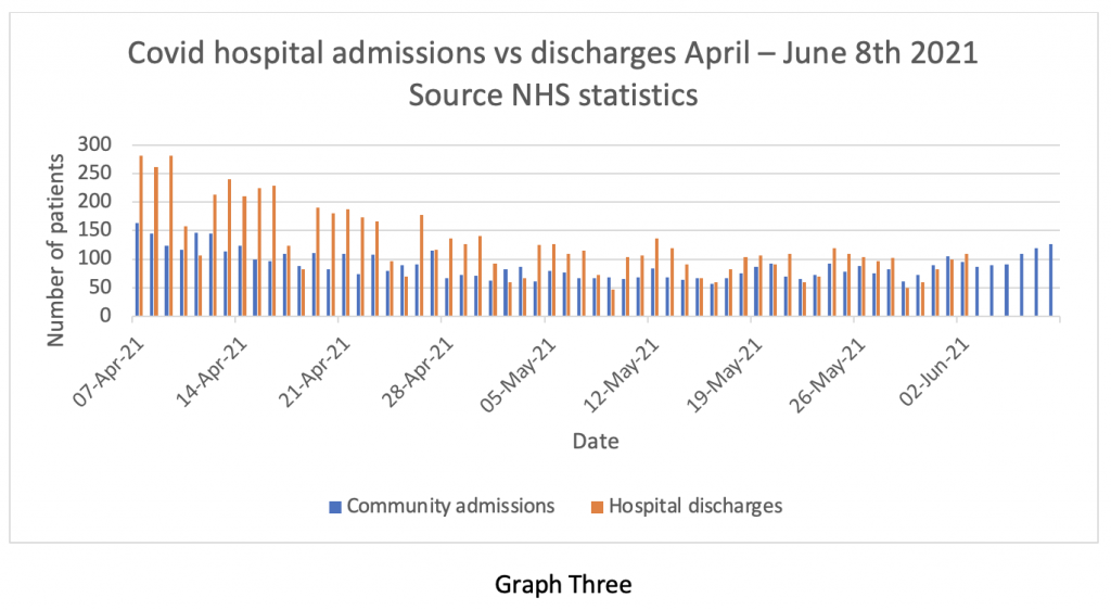
Of course, stating the number of admissions to hospital can also give the wrong impression if it isn’t balanced against the number of discharges. The NHS does not release discharge information very often, but we do have it up to the beginning of June – admissions and discharges are compared in Graph Three (blue for admissions, yellow for discharges). Clearly, admissions and discharges are pretty much in balance at the end of May and beginning of June. Earlier in the series, discharges exceeded admissions, despite the warnings of catastrophe from SAGE about the re-opening of pubs and schools.
What this graph means is that the total inpatient load on the NHS is virtually static at about 1% of capacity – patients are going out as fast as they are coming in. So, where’s the problem?
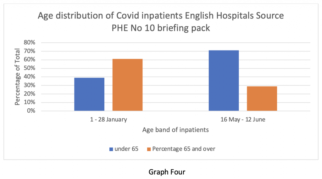
Professor Whitty did show a slide illustrating the percentage change in the age profile of patients admitted to hospital. Here it is in Graph Four. It shows the effectiveness of the vaccine in keeping older people out of hospital. But it implies that there are larger numbers of younger people being admitted instead.
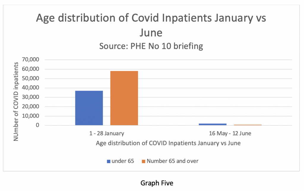
But when we look at the absolute numbers, we see the data presented in Graph Five. It shows the overall absolute numbers admitted now as a tiny fraction of those in January. Another classic statistical trick.
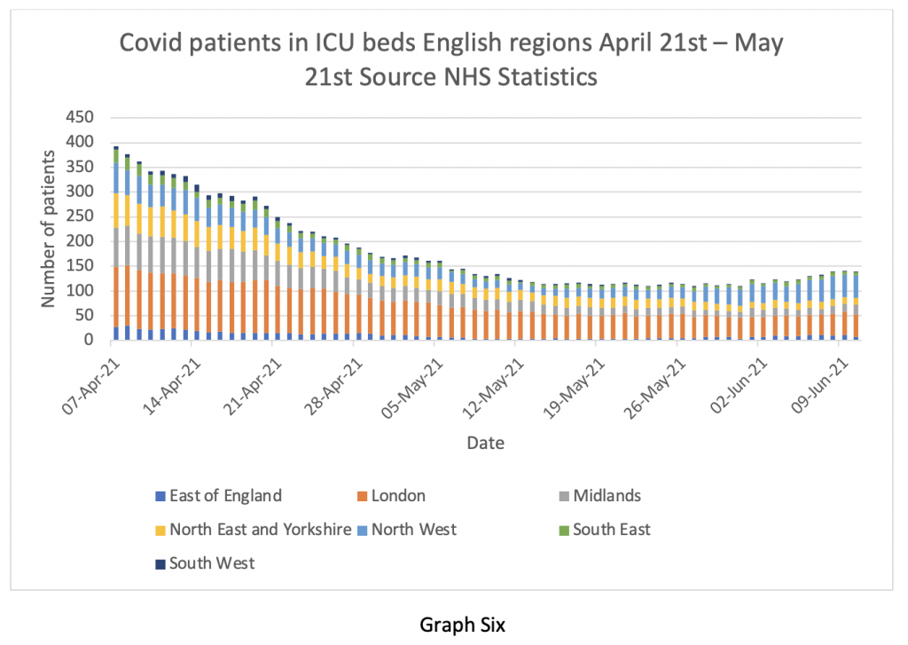
Of course, how seriously ill the patients are makes a big difference to outcome. Graph Six shows the number of COVID patients in ICU up to June 10th. There has been a tiny increase in the number of ICU cases in the last two weeks – arguably statistically insignificant, but we are well below the numbers from six weeks ago. I wonder why Professor Whitty forgot to mention this?
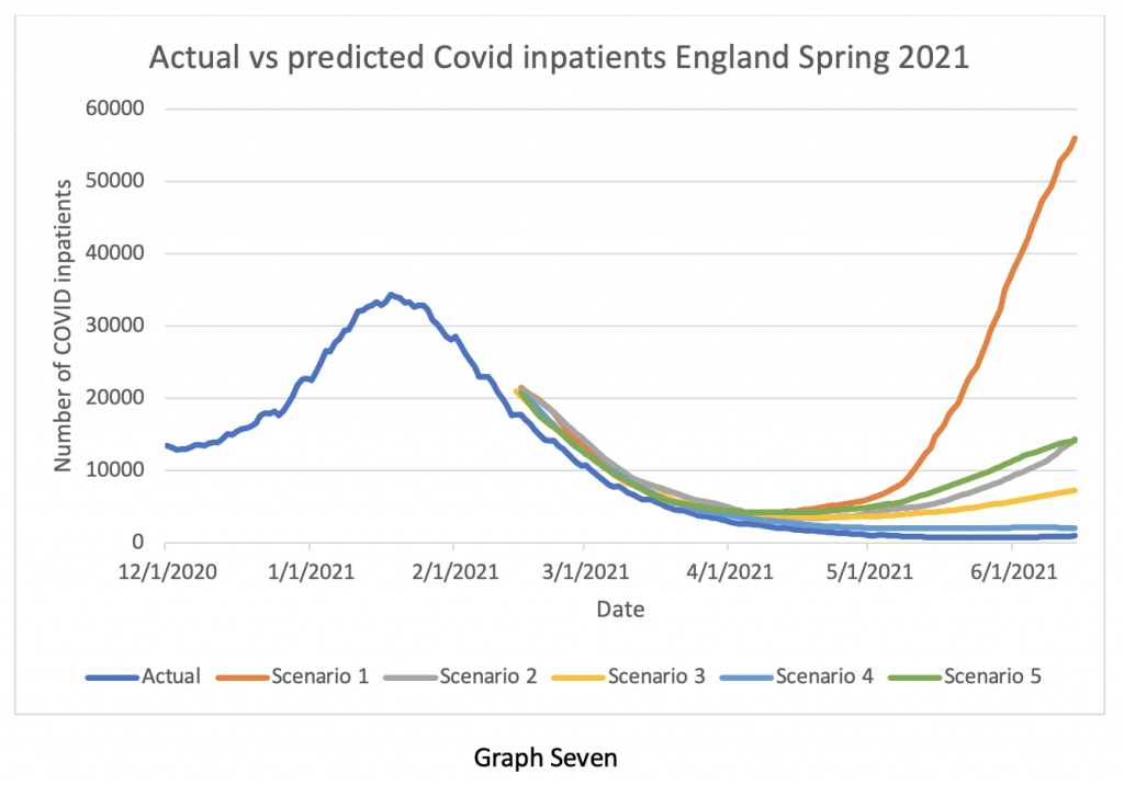
Much was made of the possibility of the situation with the Delta variant getting out of control and there being an ‘exponential rise’ in cases – I think I’ve heard that before somewhere. So, Graph Seven compares what actually happened (the lower blue line), with what the modellers from Imperial, Warwick and others predicted would happen in April and May. Look at the vertical axis – the predicted numbers of patients by the various modellers were out by factors ranging from Eight times to 50 times. The closest prediction still said we would have twice as many inpatients at the beginning of June than we actually have. Given this astonishingly inaccurate performance, why does Professor Whitty continue to have confidence in the modellers? And why does the Government continue to believe him?
And at the risk of boring the readers with official documentation, I came across a briefing note dated June 3rd from SPI-M-O, one of the acronym salad committees advising the Government.
Point 26 is interesting:
Analysis based on CO-CIN data indicated that as of 1st May, 30% of positive tests in hospital were linked to hospital acquired infection, including those in up to the fourth generation of transmission following discharge. Since then, as the number of cases in hospital have decreased, the proportion of infections that are hospital associated has increased, and was approximately 80% as of the 1st June. These estimates are preliminary and dependent on modelling assumptions used. SPI-M-O consensus statement June 3rd 2021.
To be frank, I’m still not quite sure if that can be true – do they really mean that 80% of the hospital inpatient load acquired Covid while in hospital for other reasons? Regular readers will recall I have frequently drawn attention to the (officially denied) high incidence of nosocomial infections, but I have never seen an estimate as high as 80% before. I think someone in authority needs to examine that statement and the raw data behind it very carefully and explain it to the public. It’s such a shocking number that I’m surprised the Chief Medical Officer didn’t make reference to it last night.
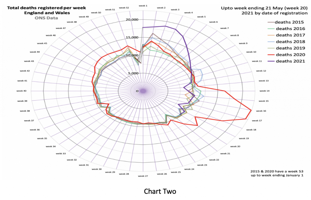
Next, we look at deaths. Here is my favourite Nightingale graphic, courtesy of Professor Carl Heneghan’s team at the Oxford Centre for Evidence-Based Medicine. The purple line shows overall deaths in England and Wales being below the five-year average up until the end of May.
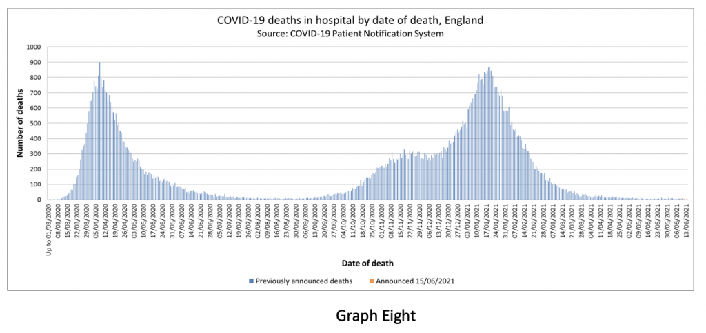
Of course, there is clearly a lag between infections, hospitalisations and deaths, so Graph Eight shows the overall Covid mortality. Can you see the worrying rise in Covid-related deaths in the last two weeks? No? Well, I can’t see it either – because it isn’t there.
The statistical tricks and data selection on display last night should be obvious to a junior medical student. They cannot be an accident or oversight. What really bothers me is just how blatant and amateurish this trickery is. It implies the Government is aware the deception will be seen through in an instant by anyone familiar with the whole picture – but doesn’t care.
The WHO still recommends that lockdowns or other societal restrictions are used as an intervention of last resort – when there is literally no other option left to prevent health services from being overwhelmed. There were occasions in the last 12 months where a reasonable case could be made to support short lockdowns. We are quite clearly not in that position at the moment.
My concern about the current situation is not just the manipulation of health data for political reasons (although that is certainly worrying), but that societal restrictions are now being viewed as a normal tool for the Government and ‘our NHS’ to use whenever they see fit – these are lockdowns of convenience, not of necessity. If the British public does not wake up and stop this behaviour, then it will continue ad infinitum.
I end with a fairly lengthy quote from Michael Gove talking in 2003 about identity cards in a Newsnight discussion:
It’s not the case that the state can demand of me certain things, those who exercise power, exercise power at my, your and David’s pleasure. Ultimately the important thing to recognise is that we as free citizens devolve power upwards – we don’t operate at the licence or leisure or pleasure of those who happen to govern us at any given point… I just have an a priori preference for limiting the powers of the state at any given time, because the general rule over the whole of human history is that once powers are yielded to the state at moments of crisis or emergency it is never the case… that the state hands them back.
I couldn’t put it any better than that.
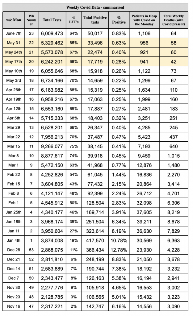
Stop Press: A reader has helpfully put together a data table showing the total number of tests, the number of positive test results, the percentage of positives, the number of patients in hospital who’ve tested positive and the total weekly deaths. As you can see, the latter two numbers are fairly flat.