
If Hospitals Are Currently Under Pressure, They Only Have Themselves to Blame
Mon 10:19 am +00:00, 11 Apr 2022
There follows a guest post by our in-house doctor, a former senior NHS medic, who says the latest ‘perfect storm’ causing pressure on the health service in parts of the country is more a self-induced squall.
In the middle of last week, several NHS Trusts issued warnings about the acute strain their services were under. The South Central Ambulance Service went so far as to declare a critical incident – normally reserved for a situation in which demands on the service exceed the capacity to manage those demands. I was surprised that so many NHS bodies spread over a wide geographical area issued public warnings about their failure to cope at the same time. Statements referred to high demand on services (hardly news) and lacked any specific detail about critical capacity constraints. Accordingly, the Daily Sceptic asked me to interrogate the available data to work out the extent to which a Covid resurgence might be responsible for the latest ‘perfect storm’ to hit the NHS.
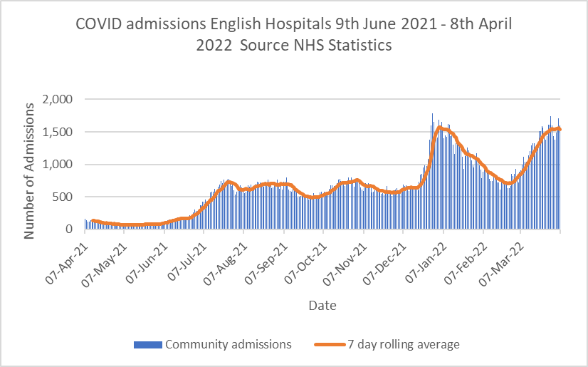
Graph 1 shows daily admissions of Covid positive patients from the community. Admissions have risen in the last few weeks, but seem to be tailing off. Data from Graph 1 have been the subject of hysterical articles in the mainstream press implying the latest Omicron BA.2 subvariant may be triggering a new wave of acute Covid infections. It’s not sensible to interpret Graph 1 as a stand-alone figure without considering contextual information from other datasets.
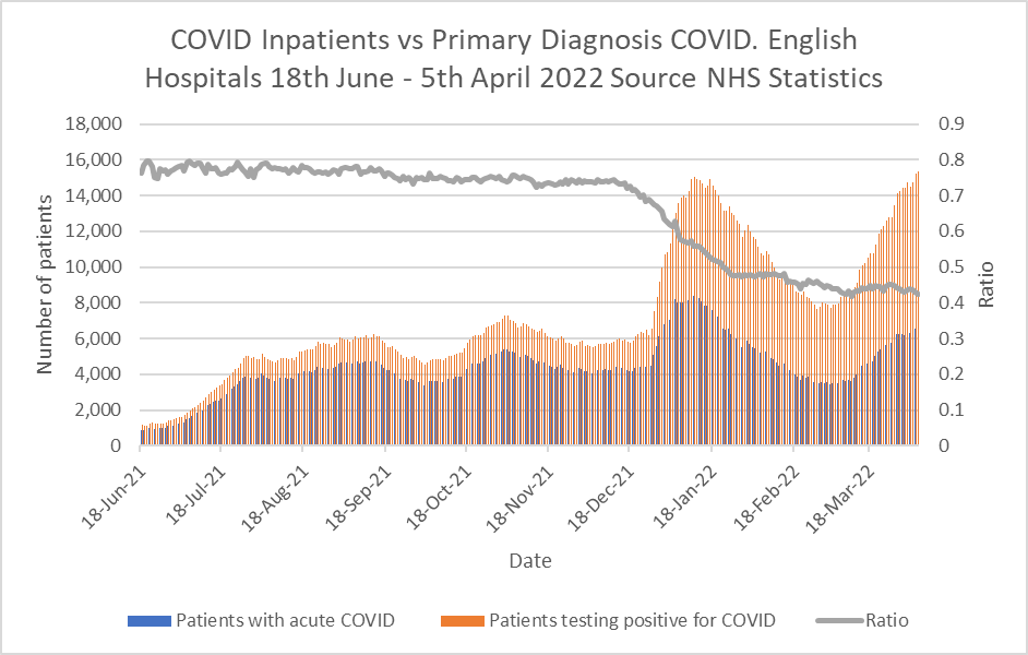
Graph 2 for example shows information from the Primary Diagnosis dataset. Regular readers will recall this set shows the numbers of patients admitted suffering from acute Covid compared to the patients testing positive for Covid but admitted for another condition. The grey line shows the ratio is gradually falling – in other words the headline figures in Graph 1 are misleading, because nearly 60% of those patients are not actually ill with Covid but admitted for other reasons.
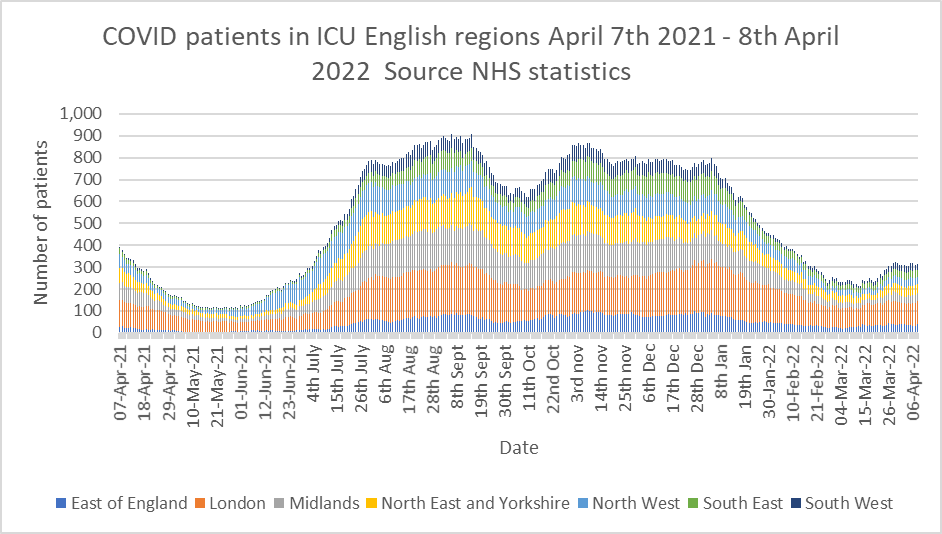
Graph 3 shows the numbers of patients testing positive for Covid in intensive care departments. The rise in cases seen in Graph 1 since the beginning of March 2022 is absent – so although there are more hospital inpatients testing positive for Covid than at the end of February, they are not ending up in critical care. Further, the data from the most recent ICNARC report reveal that the latest tranche of Covid ICU patients have lower oxygen requirements and better respiratory ratios than the cohort from this time last year – in other words, they are not as acutely ill.
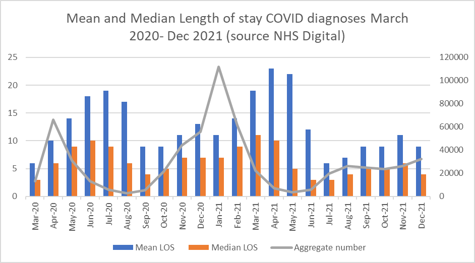
Graph 4 is very instructive. It shows the average length of stays of Covid patients up to the end of December 2021. This data was released in March and unfortunately is only complete up to the end of 2021, but it is reasonable to infer that current length of stay is unlikely to be worse now than in December of 2021, due to increased availability of new monoclonal antibody drugs which reduce disease severity for the highest risk patients. Graph 4 expresses average length of stay as the mean average (blue bars) and the median average (orange bars). Both these averages are steadily reducing with the median length of stay being down to four days by the end of December 2021. For the information of statistically curious readers, the median average in this case is probably more representative of the situation as the mean average can easily be skewed to the upside by a small number of very long-stay patients.
Overall, from the available Covid-specific patient data, we see a rise in total positive Covid tests on admission from the community, but fewer than half of these patients are symptomatic for Covid. Very few patients are ill enough to need ICU care and the length of stay for acutely ill Covid patients continues to fall. The vast majority require a few days of supplementary oxygen, intravenous steroids and monoclonal antibody infusion (or other adjunctive therapies) before being fit to discharge. So where is the problem?
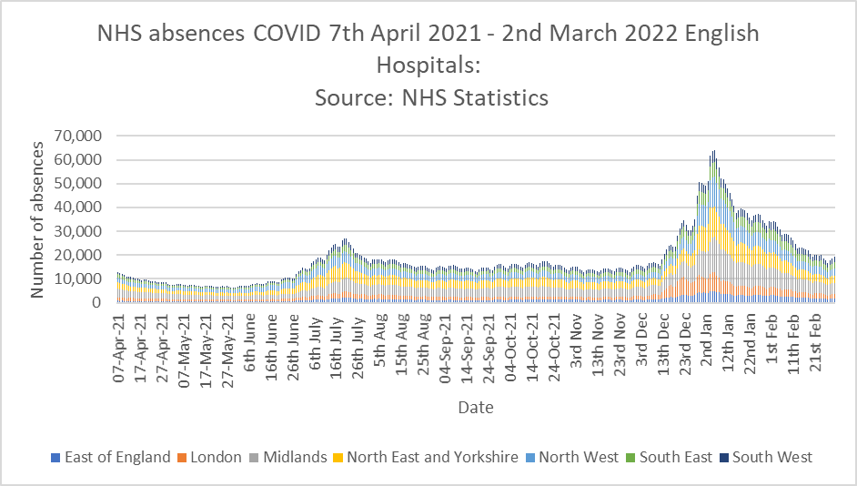
Last week Saffron Cordery, deputy CEO of NHS providers, commented that staff absences played a part in the current crisis. Graph 5 shows the data for Covid related staff absences up to March 2nd (the latest figures released) – they don’t seem to have changed much lately and were on a downward trend since the turn of the year. It’s possible they may have started to increase again, but the figures are not yet released for public scrutiny.
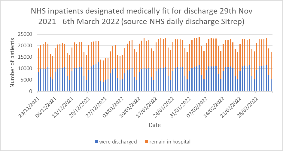
My personal suspicion is that Graph 6 shows the main issue causing trouble in hospitals. Graph 6 shows the number of patients in hospitals deemed medically fit for discharge. It is shown as a stacked bar chart, so the blue bar represents the patients who actually were discharged and the orange bar shows patients who were fit for discharge but had to remain in hospital for administrative reasons (often referred to as ‘bed blocking’). Readers will readily notice the ‘weekend effect’ in the figures, and that about 11,000 patients per day are in hospital when they are fit to be discharged – about 10% of the total NHS bed stock.
Over two years into the pandemic, the NHS does not yet seem to have solved fundamental administrative problems in relation to patient flow through the system. I am also aware from personal communication with colleagues that most NHS trusts are still imposing unnecessary Covid protocols which add to the time taken to complete basic episodes of care such as routine operations. This reduces efficiency still further in a healthcare system not renowned for operational efficiency in the first place.
Speaking about the latest crisis, Mark Ainsworth, Director of Operations at the South Central Ambulance Service, said declaring a critical incident meant it could focus its resources on the neediest patients.
Discharging medically fit patients from hospital and exercising a modicum of common sense when compiling Standard Operating procedures might achieve the same effect.