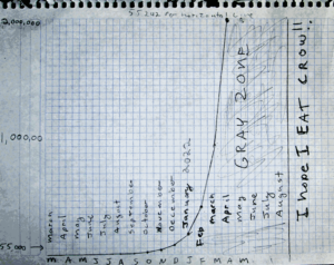
Jim Stone’s chart of skyrocketing rates of death from the vaccine amongst 25- 34 year olds.
Sun 7:30 pm +01:00, 30 Jan 2022Worried that this chart I did is right. To be clear, in case people missed the point of this chart this chart is based on CDC data showing an upward trend in overall non-covid related deaths for the age group 25 – 34. The upward trend corresponds with the introduction of the vax. The upward trend became so obvious in the data that they stopped releasing it. The chart is based on a calculated progression for what that data would do if allowed to continue on the same path as the data from 6 months before July, when the vaxxes were released. It shows what the CDC is refusing to allow the public to know. It shows when we go into the hockey stick.
Six months of data is enough to get an idea where things will go, but it was not enough to nail the date with precision. What is in this chart is simply what the math did with limited input, the math said catastrophe before the end of april but I put in a gray zone for possibly as long as September because the initial sample was not enough to pin “when” down exactly, despite it being good enough to clearly state it “will” happen. HERE IS WHERE WE ARE GOING FOR AGE GROUP 24-35, READ IT AND WEEP. This is the same chart I have posted before, it is too important to post only once.
This is when the MRNA vax deaths will skyrocket.