
Seven indicators that show infections were falling before Lockdown 3.0
Fri 11:36 am +01:00, 5 Feb 2021Data from seven different indicators establishes that infections were already in decline in England before the January lockdown
Now that infections and hospitalisations in England are declining steadily, one hotly contested issue is whether, as was the case back in November, infections started decreasing before the national lockdown began formally on 6 January.
Working out precisely when infections started to turn down is not an easy task. For obvious reasons, we are unable to observe the time when someone gets the virus. Rather, we have a series of different indicators such as symptoms, a positive test, hospital admissions and death, all of which we can only observe sometime after the actual infection.
All the different indicators have pros and cons, so, when trying to estimate a peak of infections, it is unwise to rely on a single measure.
Each of these indicators suggests that infections started falling sometime around the end of December
A particular issue is estimating the lag between infection and the indicator such as a positive test. Based on Center for Disease Control estimates, the average time from infection to symptoms is about six days. A further five days to hospitalisation, and about another 10 days to death. Some of those estimates vary with age, but they give a sensible starting point for working out the timing of the infections peak.
Another problem is that some indicators suffer from day-of-the-week anomalies (e.g., fewer tests taking place over weekends). In these cases, using the seven-day centred average (7DCA) can help to smooth the data.
We now have sufficient data from seven different indicators to help us establish whether infections peaked before or after the national lockdown. So, what do they tell us?
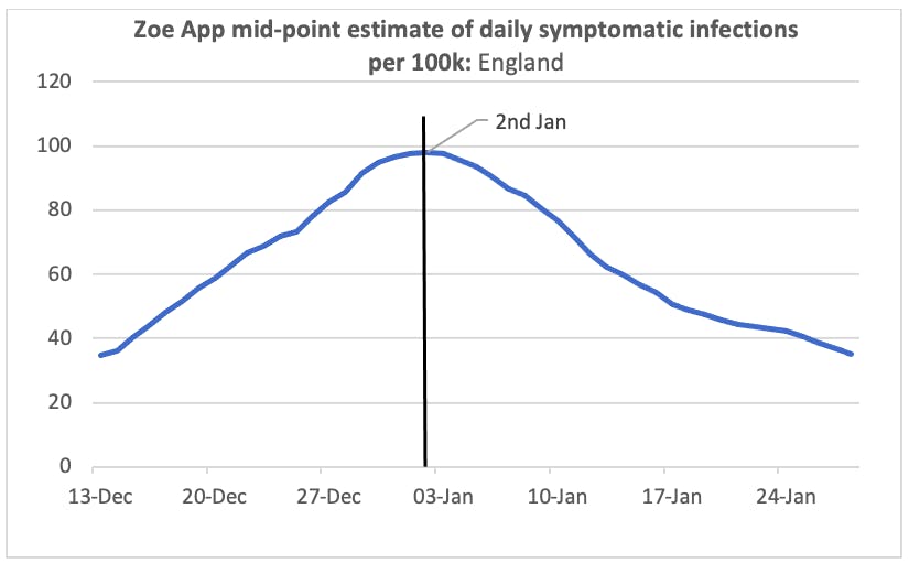
1. King’s College (Zoe) symptom app provides estimates of the number of new daily cases with symptoms based on a large, daily survey of app users. Their mid-point estimate peaked on 2 January and declined steadily thereafter. Assuming a six-day lag, that suggests infections started dropping from about the 29 December.
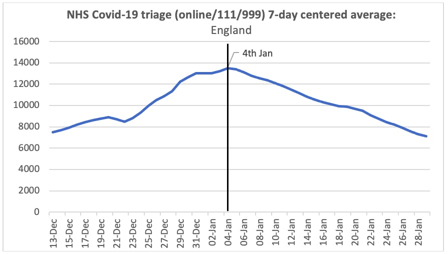
2. NHS triage journeys with a potential Covid-related final disposition are reported each day. The 7DCA of total journeys (online or from 111 or 999 calls) peaked on 4 January, implying infections started falling from about the 31 December.
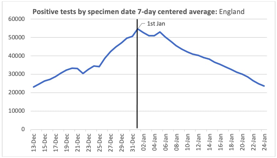
3. Positive tests provide the daily headline figures for new cases. The 7DCA peaked on 1 January. Allowing for time between observing symptoms and getting a positive test, that suggests infections started falling from about the 27 December. However, Christmas testing and reporting effects over the period mean trends in the testing data should be treated with caution. For example, the blip in the downward trend on the 5 January is caused by the low number of positive tests from specimen dates on the New Year’s Day bank holiday dropping out of the 7DCA.
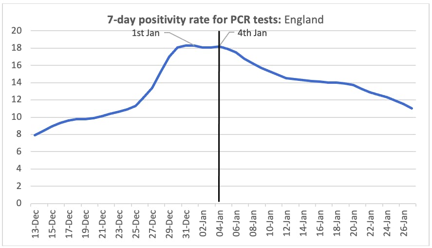
4. Positivity percentage provides a complement to the actual number of positive tests, partly as it is less likely to be affected by expansion of testing in particular areas. The percentage of PCR tests which were positive in the previous seven days peaked on 1 January. Following a few days of ups and downs, the measure decreased steadily after the 4 January, implying infections started falling at least from about 30 December.
5. ONS Infection Survey provide the official Government estimates of Covid-19 prevalence in the community (i.e. excluding care homes and hospitals). The ONS modelled estimates indicate prevalence of those who would test positive peaked on 1 January. Note that the peak of prevalence will occur sometime after the peak of new infections. The latter is hard to pinpoint from this indicator as, unfortunately, the ONS have temporarily suspended their estimates of daily new infections.
The REACT survey based at Imperial College provides another estimate of prevalence. Unfortunately, as there was no wave of the survey between 4 December and 4 January, it is unable to give us any indication of the infection peak.
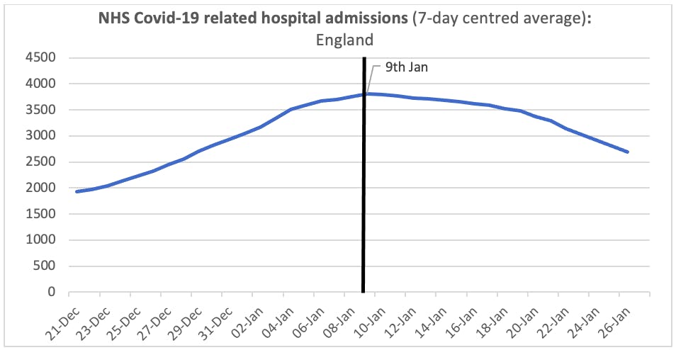
6. Hospital admissions peaked on 9 January based on the 7DCA, decreasing thereafter. This implies infections started coming down from about 30 December. The single day peak of admission was actually on the 12 January which could place the infection peak a little later.
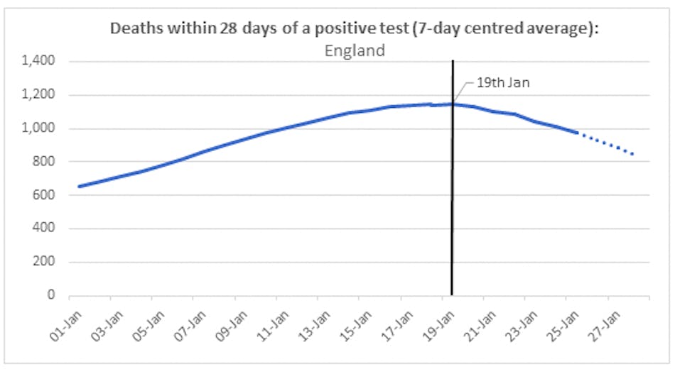
7. Deaths using the headline Public Health England measure (i.e. deaths within 28 days of a positive test) peaked on the 19 January based on the 7DCA, implying infections started falling from the end of December.
Each of these seven indicators suggests that infections started falling sometime around the end of December. Although the precise timing of the decrease depends on assumptions about the infection lag, it is noteworthy that some of the indicators themselves (i.e. ignoring any lag) started falling before the January lockdown was even announced.
We must be careful not to infer too much about what this tells us about lockdown effectiveness. For example, these indicators do not tell us for sure that infections would have carried on falling if there had been no lockdown. It is also possible that the lockdown meant infections fell faster than they would have done otherwise.
A further question is whether earlier factors such as areas going into strict Tier 4 restrictions and schools being closed for the holidays caused infections to decrease. Again, this is an issue for a separate discussion, though it is noteworthy that infections seem to have decreased before lockdown in pretty much all regions including those not already in Tier 4.
What we can conclude, and with a level of confidence approaching certainty, is that infections had started to fall in England some time before the January national lockdown.
David Paton is Professor of Industrial Economics at Nottingham University Business School. He Tweets as @CricketWyvern. He is a member of the Health Advisor and Recovery Team (HART) www.hartgroup.org/
https://thecritic.co.uk/seven-indictors-that-show-infections-were-falling-before-lockdown-3-0/