
A Senior Doctor Writes…
Fri 10:54 am +01:00, 15 Jan 2021There follows a guest post by the senior doctor who contributes weekly updates on the state of the NHS to Lockdown Sceptics.
Yesterday the NHS Hospital Statistics Website released a large data packet summarising Covid related activity for the preceding month. Once again, Lockdown Sceptics has kindly asked me for an opinion about what we can deduce from the information provided. There is a lot of useful information in this packet – I apologise to readers if some of the following is a bit dense, technical and difficult to follow, but the devil is often buried in the detail – sometimes he is hidden there deliberately.
Before looking at the monthly summary, I will comment on the daily updates. These are less detailed but more up to date than the monthly figures.
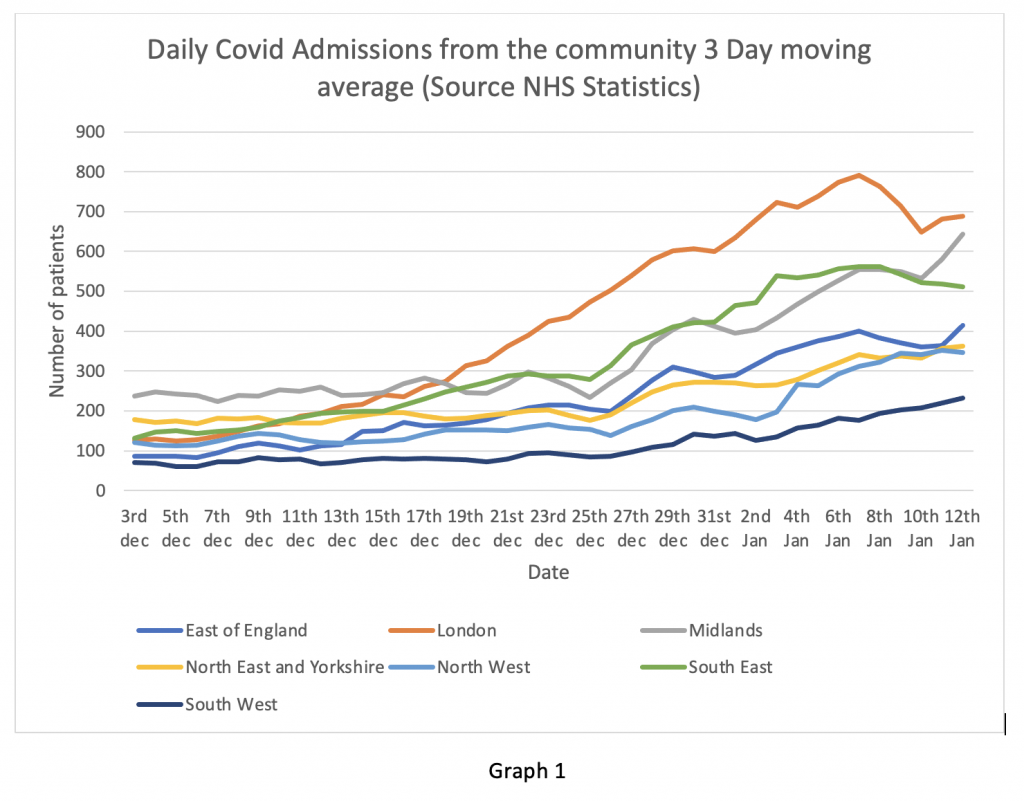
Graph 1 shows the daily admission figures from the community for English regions expressed as a three-day moving average to smooth out the curves. It is clear that for the last week, admissions from the community in London, East England and the South East have been falling – very encouraging.
However, there have been recent uptrends in the Midlands and the North West. The falling rate in London and the South East is consistent with the ZOE app data which showed a downtrend in symptomatic people from about December 31st. Readers should note that the current lockdown began on January 6th. By that point admissions had peaked and were already on the downward slope. The effect (if any) of lockdown on hospital admissions will not be observable until at least January 16th. Nevertheless, the reduction in hospital admissions is being reported in the mainstream media as being a consequence of lockdown – I don’t think that view is supported by the evidence.
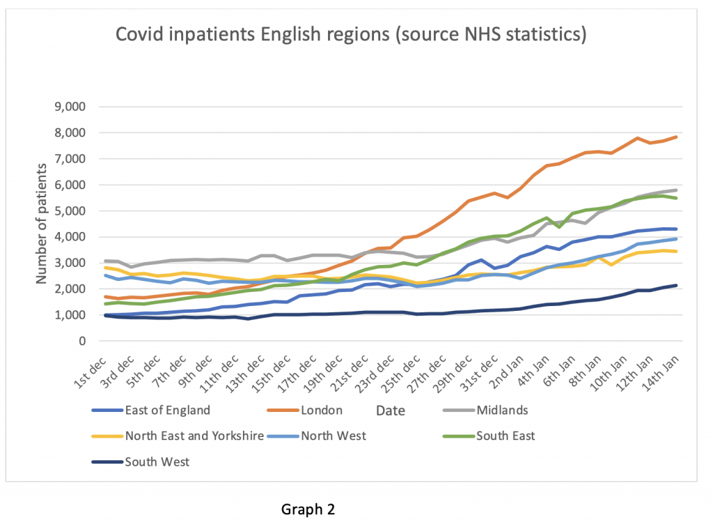
Next, the overall inpatient situation on Graph 2. Despite falling admissions from the community, the overall number of Covid patients in London remains flat. How can this be? I will explain later with data from the monthly summary packet.
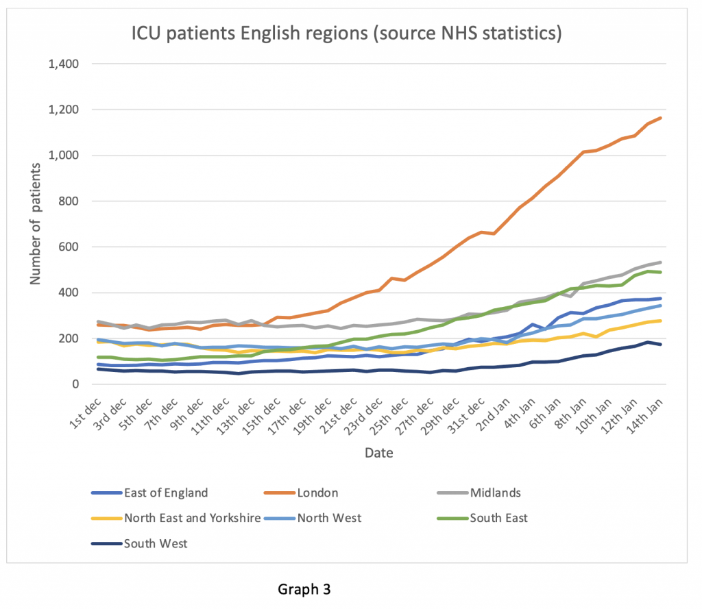
Finally, on the daily figures, the ICU bed occupancy data in Graph 3. This is the graphic of most concern in my opinion. ICU occupancy tends to lag inpatient admission by two to three days – this is the length of time for a patient to become ill enough to require intensive care according to the ICNARC ICU audit. Hence falling admissions do not immediately translate into falling ICU numbers. The angle of slope in London in particular is still on an upward trend. Some of this may be because London Hospitals are soaking up ICU admissions from the South East region, where local hospital capacity has been exceeded. ICU patients tend to stay a long time, so these numbers take a while to subside when the peak is reached. As far as ICU numbers are concerned the peak does not look like it has arrived yet in any English region. In particular the ICU numbers are still on an upward
The monthly data packet contains a lot of information which I will comment on in the next few days. It has been illuminating in shedding light on several questions which were troubling me. I propose to address just two this evening.
Firstly, the issue of discharging Covid patients from Hospital. Discharging elderly patients in winter is an annual problem. Patients who cannot be discharged are unkindly referred to as “bed blockers”. The usual reasons are that they are too frail to be sent home alone if there is no-one to look after them, or not well enough to be accepted back by a care home. This problem is worsened by care homes being reluctant to accept Covid patients in view of what happened in the spring, when large numbers of patients with Covid were discharged into care homes causing several outbreaks of infection. An article in the Financial Times recently highlighted that insurers of care homes were reluctant to cover them for outbreaks of COVID-19 and that this was delaying hospital discharges.
Graph 4 shows the effect that delayed discharge has on total bed occupancy. This is a complicated compound graph with two separate Y axes, so I will explain what it means. First, consider the first part of the X axis Dec 1st to Dec 9th. During this time, the combined daily admissions and hospital Covid diagnoses depicted in the vertical bars was roughly equal to the daily discharges on the blue line (left hand Y axis). Hence the total number of Covid inpatients on the yellow line was roughly stable.
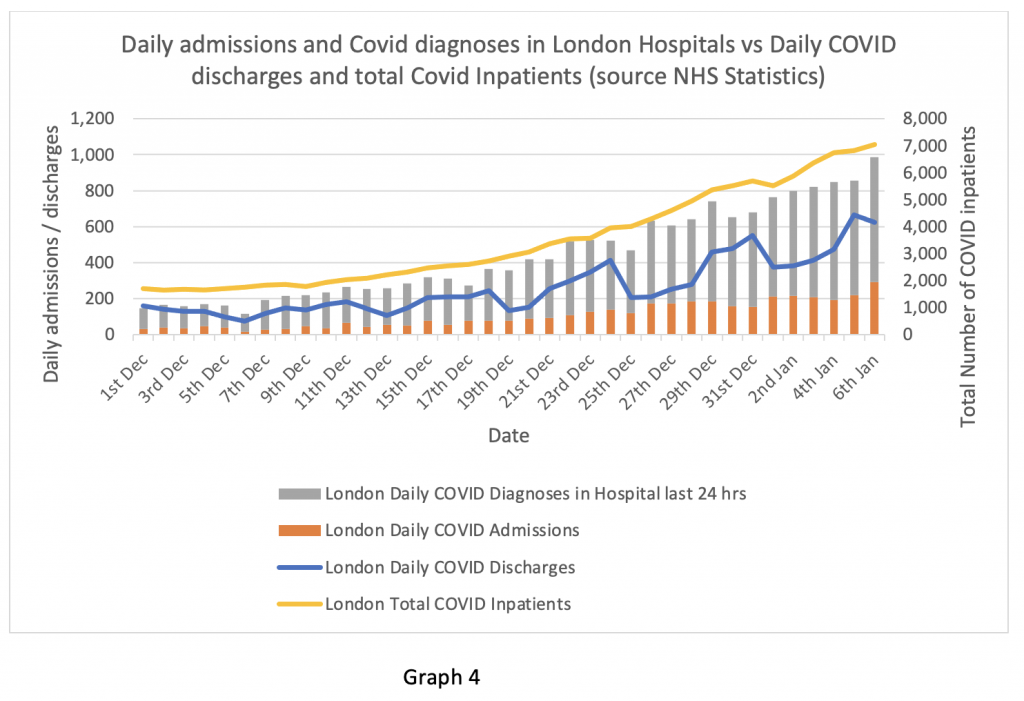
From December 10th onwards, daily admissions started to exceed discharges and this trend has worsened as the graph proceeds through December into January. As a consequence, the total number of inpatients on the yellow line (right hand Y axis) continues to rise. Readers should note that the monthly figures are only presented up to January 6th, so as of this data packet the admissions downturn on January 7th is not yet visible.
This is clearly a major problem. Although admissions may be falling, the total number of inpatients is still rising because of failure to discharge. In London, the Nightingale hospital has reopened for ‘step down’ patients (not ICU patients as in the spring). It remains to be seen how successful that will be, bearing in mind that shortage of staff (not bed capacity) was the rate-limiting problem in the spring. Elsewhere, some imaginative and intelligent steps have been taken such as utilising spare hotel capacity to place convalescent patients – an affordable and practical solution, often used in the United States.
Now here is one devil. We know hospital discharge is always a problem in the winter. It was entirely predictable that this would be an issue in a ‘second surge’ of COVID-19. A predictable risk, with no plan to deal with it. I wonder why there was no plan? And who is taking the responsibility for the lack of one?
Next, I turn to the issue of age stratification of Covid patients. A few days ago, I saw an article on the BBC news by the reporter Hugh Pym. He visited Croydon University Hospital and reported that there were “many more younger patients” affected by Covid in the winter than in the spring. The monthly data packet does contain age stratified figures for hospital admissions. I thought I should examine these.
First, I looked at the data for England as a whole. It is recorded that 37% of the Covid patients admitted from March 20th to April 30th were aged between 18 and 64. Between November 27th and Jan 6th, 39% of patients were in this younger age bracket – a very modest increase and certainly not “many more” younger patients.
The age bracket 18-64 is quite wide and it could be possible that the distribution is skewed to the younger part of that group. Therefore, I looked at the reported death statistics across the spring and the winter up to Jan 1st 2021, which are much more clearly age stratified. Between March and May 2020 there were 45,511 reported deaths from Covid, of which 3,020 were aged between 0 and 59 years (6.64%). In the period November to January 1st, there were 20,370 deaths of which 1,073 were registered as COVID deaths – 5.26%. So, in fact there were proportionally fewer Covid deaths in the younger age group in the winter than in the spring reported up to January 1st.
Bearing in mind that death registration can lag date of death by up to two weeks, I looked at the ICNARC ICU audit data comparing cohorts of patients admitted up to August 31st and after September 1st till January 6th. Age at admission to ICU was actually older in winter than spring: Mean average 60.2 years in the winter, median 62 years, compared to a mean of 57.8 and a median 59 of years in the spring.
How can we explain this discrepancy? There do not appear to be “many more” younger patients suffering from Covid in hospital this winter. In fact, the official figures suggest that there are proportionally fewer very sick younger patients and fewer deaths in this age group than in the spring. If that is correct, why did Hugh Pym report precisely the opposite on the national news?
Perhaps someone from the BBC could contact Lockdown Sceptics to explain what I’m missing in this data? Surely, the lavishly taxpayer funded BBC, with hordes of researchers, fact checkers and expensive journalists, must be more accurate in its interpretation of the data than one private individual with a laptop and an internet connection. Maybe they have access to more up to date information than I can see. I would be most grateful to be shown the errors in my calculations and will be happy to be corrected if I have misinterpreted the figures.
Finally, having looked at the recent past (monthly data summary) and the present (or as close to it as we are permitted to see by the daily figures), I will turn to the future.
The drop off in community symptoms reported on the ZOE app and reflected in the drop in hospital admissions in London, the South East and East of England is certainly welcome. However, it begs the question of why further lockdown restrictions were necessary on January 6th when the community transmission appeared already to have peaked.
On the other hand, the rise in admissions in the Midlands and the North West is of concern. In particular, the rising trend in ICU admissions is worrying. These are likely to continue to rise for several days at least. An issue that may not be obvious to the non-medical reader is that there are substantial differences between the hospital geography of London and the rest of the UK. A densely populated metropolis like London has several large hospitals in close proximity to each other, all with substantial surge capacity to deal with peaks of excessive demand. Mutual support between hospitals is relatively easy to arrange and co-ordinate, so patients can be transferred between hospitals to manage areas of high stress.
Other regions of England are not so fortunate. Even the larger urban areas of the Midlands and Greater Manchester have fewer large hospitals than London. Transfer of patients between hospitals is more problematic. ICU capacity in particular is not rapidly expandable as it is in the capital and surge resilience, particularly in more rural areas, is lower. This could be a serious problem in the coming days. I hope NHS England has a workable plan in place, but I smell sulphur.
https://lockdownsceptics.org/