The Nonsense of “Cases”
Thu 10:04 am +01:00, 17 Dec 2020
With the tier changes for England being agreed yesterday and set to be announced today (with the exception of London and some nearby areas, which have already been placed in Tier 3), I decided to look up how my area was faring. I live in Warwick District, which was right at the bottom of the Tier 3 metrics on December 2nd, so I looked up on the ZOE app how we were doing now, and was mightily encouraged (the ZOE app estimates are based on reported symptoms as well as PCR testing so avoid some of the pitfalls of false positives).
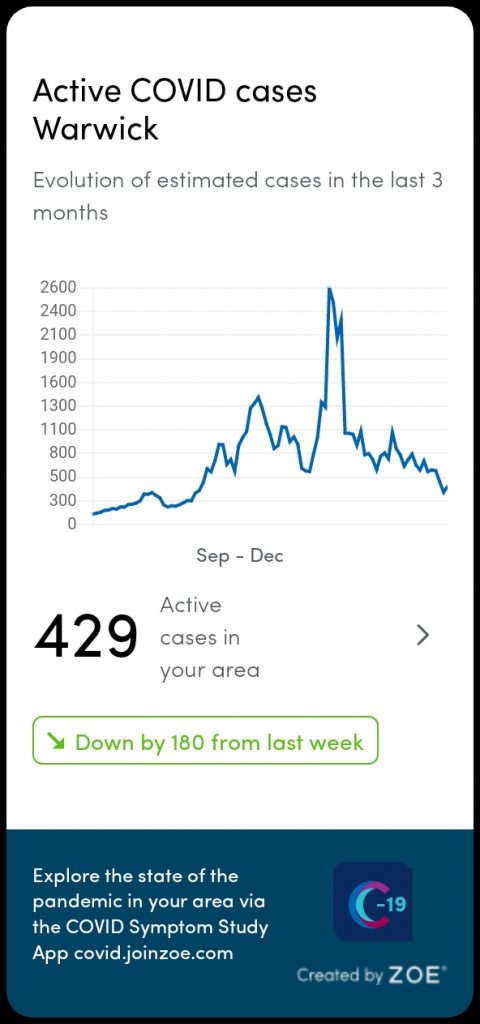
Only 429 symptomatic cases in the whole district (population ~142,500), clear downward trajectory, looking good. Then I spotted the Telegraph had a postcode tool to find out how your area is faring on the Government’s metrics. This is what came out for Warwick.
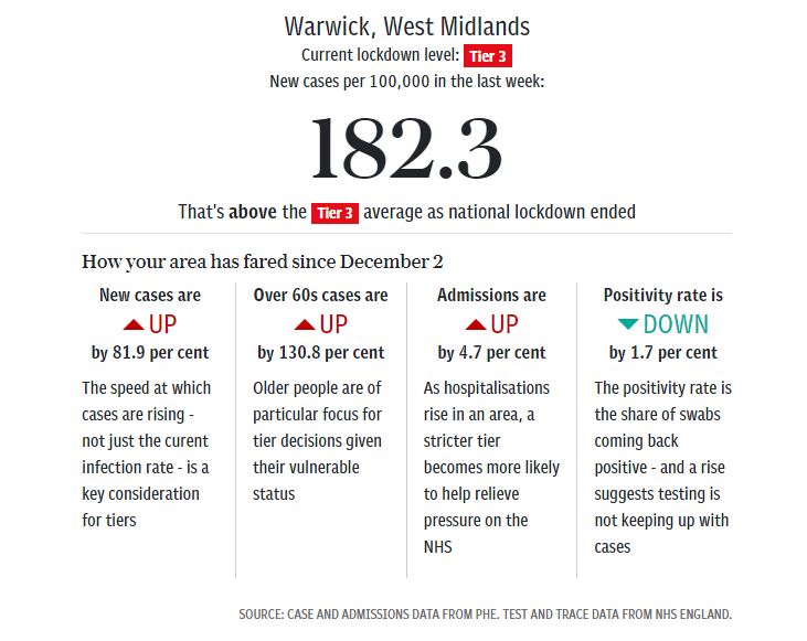
Blimey. Cases up nearly 82%. I went to the graph on the Government dashboard.
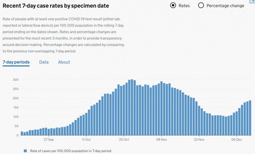
Sure enough, a totally different shape to the ZOE data in recent weeks. That’s the wonder of PCR and of not controlling for test numbers (notice the Telegraph tool shows the positivity rate headed down). Yet we’re told “case” numbers are a major part of the equation for tiers and all the scientific advisers, politicians and pundits go on about them like they’re telling you something meaningful about the epidemic. Ludicrous.
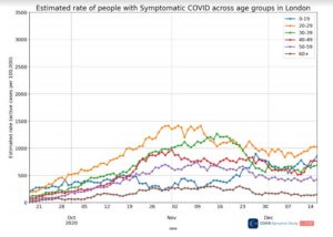
How’s London doing today? According to ZOE, symptomatic infections in the 20s, 40s and 50s age brackets, which were previously rising, stayed flat for a second day (though there was an increase in the under 20s). Still no sign of that out-of-control epidemic that might warrant laying waste to the hospitality trade.
https://lockdownsceptics.org/