
What’s Killing Americans?
Fri 10:57 am +01:00, 4 Sep 2020Stacked area chart showing deaths by age group from February 1st to August 26th 2020. It is divided into: deaths not involving COVID-19 (light blue), deaths where COVID-19 is a “co-morbidity” with other diseases (dark blue), and deaths from COVID-19 alone (red).
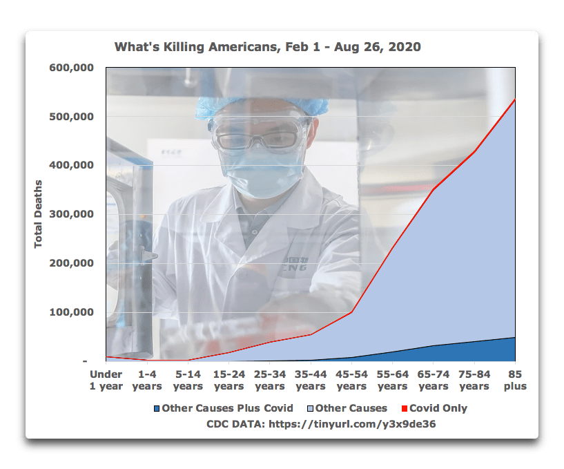
Inspired by the news from the US that only six per cent of reported COVID-19 deaths mention no other contributing causes, Willis Eschenbach on Watts Up With That took a closer look and made the above graph. He explains:
The light blue area is all of the deaths that did not involve Covid.
The dark blue area at the bottom represents the deaths of people with one or more other diseases or conditions who had Covid as a co-morbidity. It goes from 0.2% of all deaths for infants, and steadily increases with age to stabilize at about nine per cent of all deaths for all ages over 65. Some of these diseases and conditions are the result of Covid, and some are unrelated to Covid.
Fun fact. A total of 4,758 of the deaths in the dark blue area are from “Intentional and unintentional injury, poisoning and other adverse events” with Covid as a co-morbidity. So this includes e.g. the guy in Florida who died from a motorcycle accident and tested positive for Covid… clearly the category shown in dark blue includes both deaths with Covid as well as deaths from Covid.
The thin red area at the top, scarcely wider than a line?
That’s all of the deaths from Covid by itself. It’s tiny because most of the time Covid either causes other diseases, as when someone presents with Covid and then gets pneumonia as well, or because Covid is often non-causally associated with other diseases and conditions.
The takeaway message? Even with the old and ill, deaths with Covid plus deaths from Covid are less than ten percent of all deaths. For those under 14 years old, it’s less than one percent of all deaths. For infants, 0.2%.
Worth reading in full.
By
https://lockdownsceptics.org/