
Oregon’s COVID-19 data isn’t scary, so why the panic?
Mon 9:55 am +01:00, 6 Jul 2020By J.B. Handley
Like many others, my home state of Oregon is either rolling back or suspending openings due to a surge in positive COVID-19 cases which is linked, directly, to giving more COVID-19 tests. In fact, Governor Kate Brown just extended her emergency order here by 60 more days, through September, and there’s recent talk we may not have in-person school in the Fall. What’s astonishing about all these decisions is that anyone could look at the actual data produced by the Oregon Health Authority and quickly realize that we are under no threat whatsoever from COVID-19, so please join me for that quick journey, I promise to keep this brief!
First, it’s important to recognize that EVERY virus behaves according to a principle known as Farr’s law that was discovered over 100 years ago. This explanation of Farr’s law from Oxford is incredibly easy to understand, and here’s my favorite quote:
“Once peak deaths have been reached we should be working on the assumption that the infection has already started falling in the same progressive steps. Using deaths as the proxy for falling infections facilitates the planning of the next steps for reopening those societies that are in lockdown.”
And, here’s the chart from Oxford showing how ALL viruses behave, since the beginning of time:
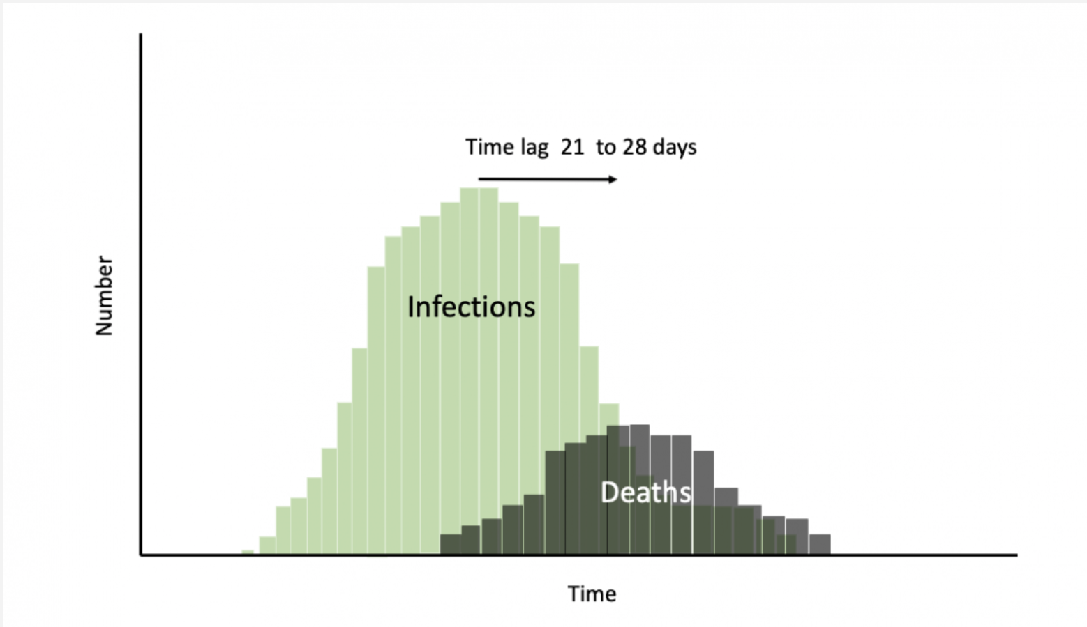
Did you read that part about “peak deaths”? When it comes to understanding the trajectory of a virus, that’s really all you need to know, and nationally we are WELL PAST peak deaths, look at CDC national data:

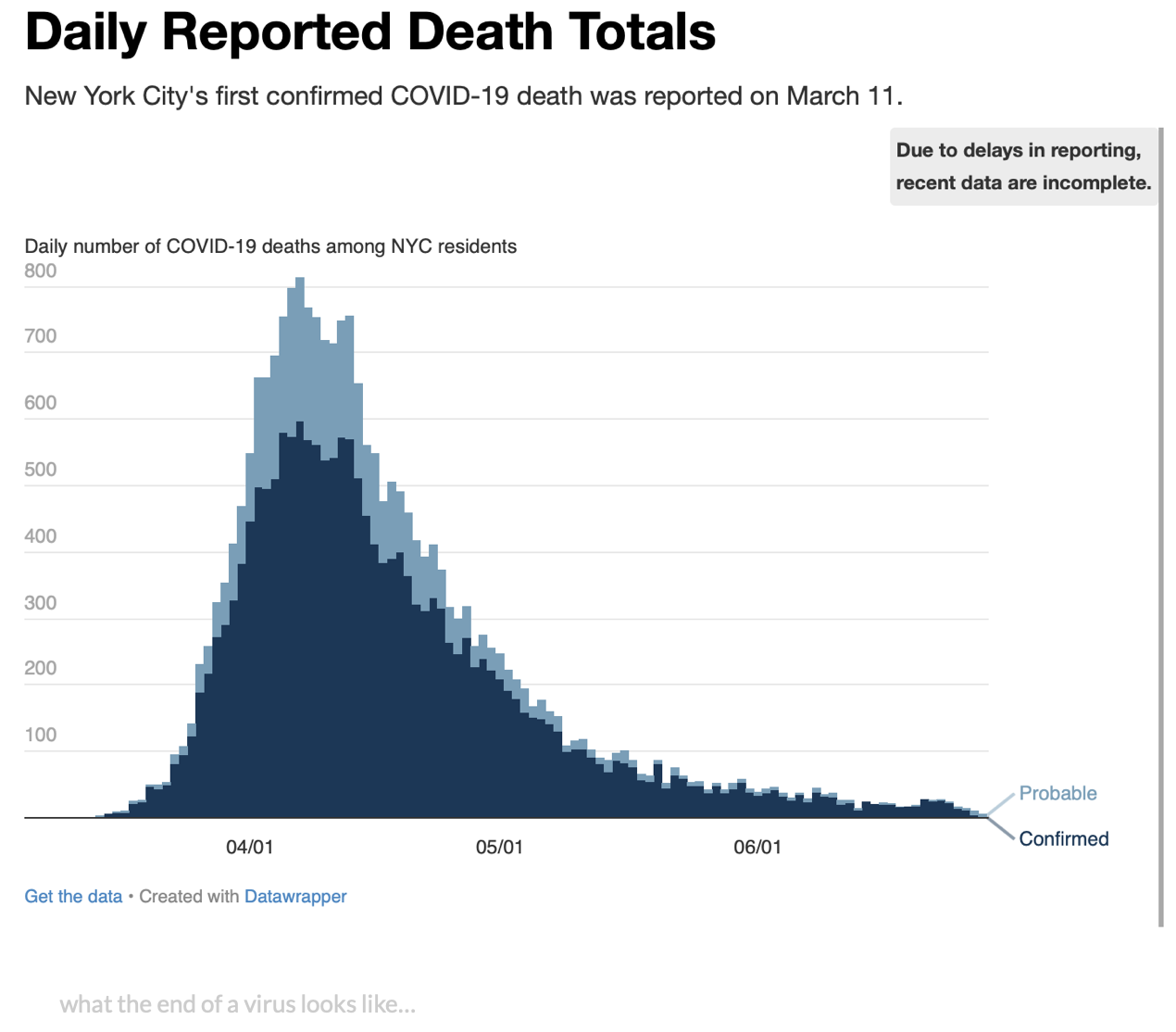
This concept of peak deaths is so important that Oxford quotes William Farr at the top of their article about him where he says: “The death rate is a fact; anything beyond this is an inference.” What’s his point? Deaths are the ONLY way to understand the path of a virus, and how close we are to snuffing it out. And, all over the world, it’s extremely clear that we are well-past peak deaths for COVID-19, no matter what you read in the press. I’ll just show you one more chart, and then move on to Oregon. Here’s New York’s deaths, over time. Notice a peak?
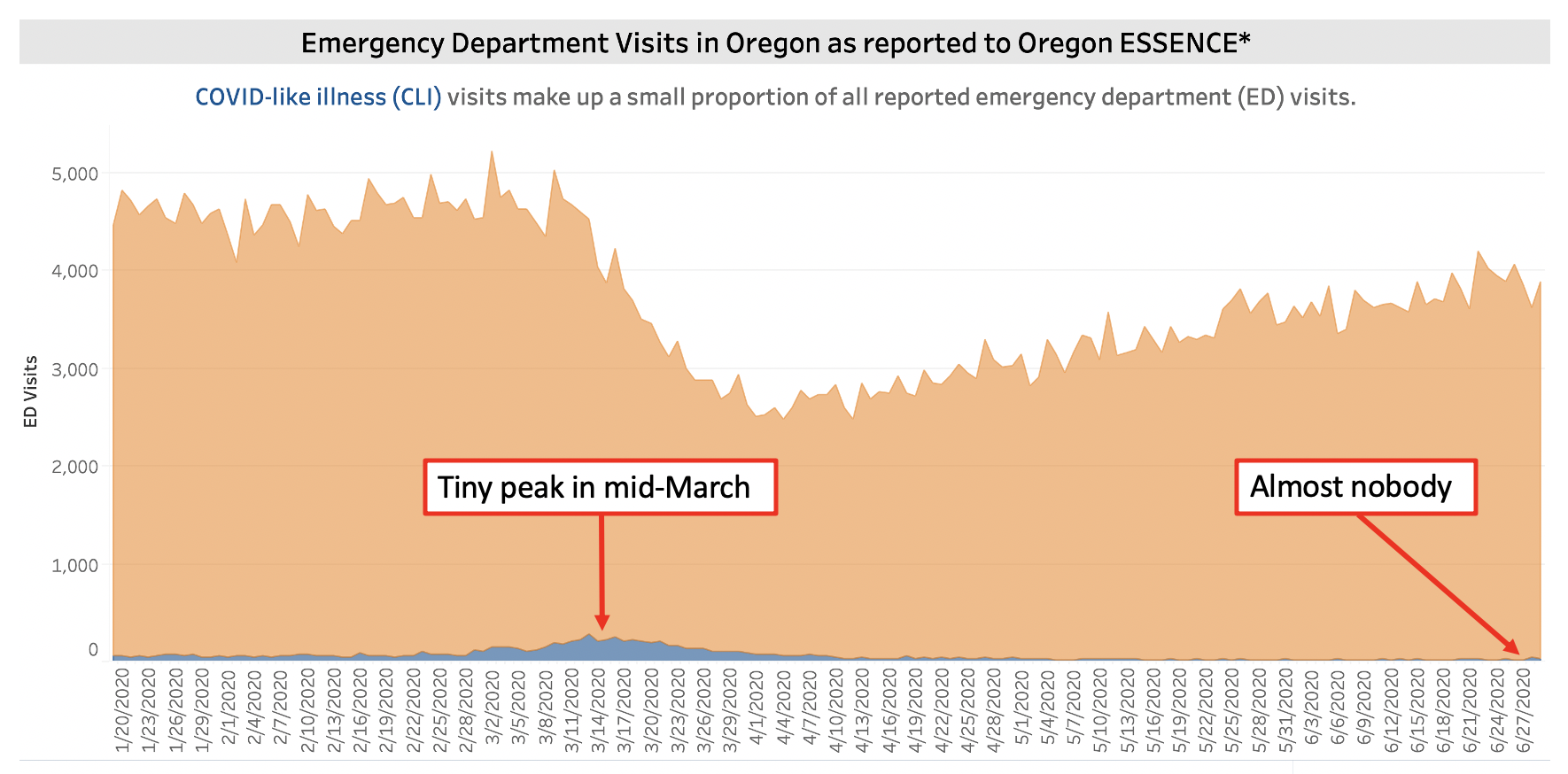
Every weekday in Oregon, the Oregon Health Authority publishes numbers about COVID-19 in Oregon, and every day I am astonished by the disconnect between the headlines, the behavior of our Governor, and the actual data. Here’s the most recent update, published yesterday. What does it show? Well, here’s the first chart worth studying very closely. It shows emergency room visits by people with COVID-like symptoms in Oregon hospitals (not even necessarily confirmed!), and it shows we had a small peak in March, and that today the number is well under 1% of E.R. visits (it’s that tiny blue speck). Obviously, emergency room visits does not equal deaths, but we’re trying to identify a peak, and visits to the hospital is a reliable indicator, which means it’s very, very likely that COVID-19 in Oregon peaked in mid-march.
And, since hospitalizations can be a reliable indicator of the arc of a virus, check out this slide, showing hospitalizations over time in Oregon for COVID-19, which I got from the OHA here.

Notice anything? I’d make two points:
-
Oregon’s hospitalization numbers for COVID-19 are remarkably TINY. We are averaging 7 people a day in a state of 4.4 million!!
-
The peak obviously was back in mid-March, just like the previous slide.
So, why are people panicking? The only thing I can see in the OHA data that’s actually going UP is the number of daily TESTS ADMINISTERED, check this out:

Notice anything? In mid-March, when the virus clearly peaked in Oregon, we were testing roughly 1,200 people a day. Today? 4,800 a day, a 400% increase. What do you know—we have more positive cases! I just can’t make this point strongly enough: positive cases in isolation are MEANINGLESS to track COVID-19.
If you aren’t shocked enough yet at how LOW Oregon’s numbers really are, here’s another one for you, showing the percentage of COVID-like symptoms being exhibited by emergency room admits, please try to guess when we had our peak:

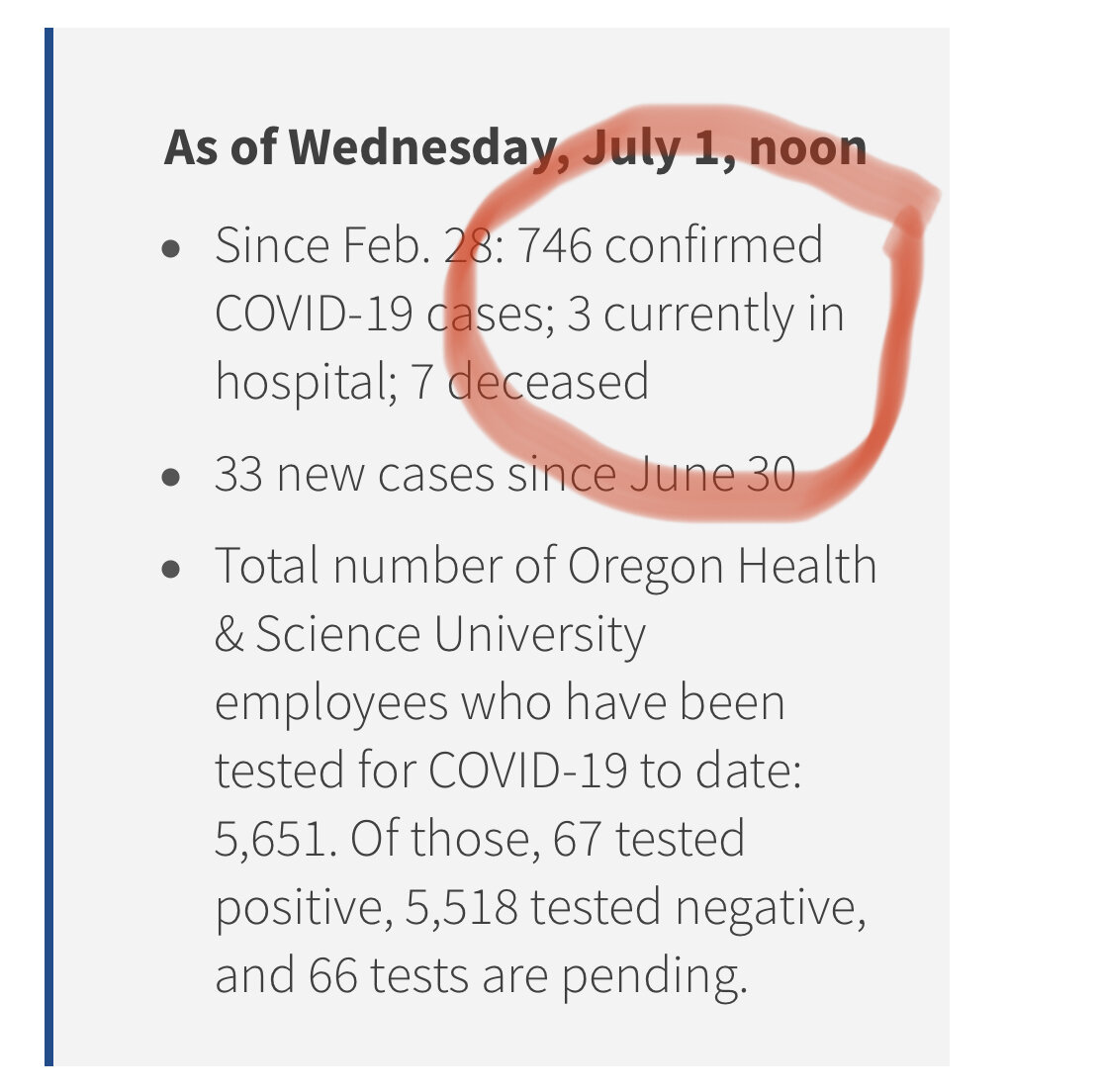
Portland’s largest single employer is Oregon Health Sciences University with over 17,000 employees. US News & World Report voted OHSU the best hospital in Oregon, they treated over 300,000 patients last year, and currently have 562 staffed hospital beds. OHSU also has taken the rare step of publicizing all of their COVID-19 data for anyone to see, which makes it easy to determine how many Oregonians are currently hospitalized at OHSU for COVID-19. And that number, as of tonight July 1, 2020 is…wait for it…THREE.
Are you seeing a pattern here? If not, I’ll spell it out for you:
-
Covid-19 peaked in Oregon in mid-march
-
Our numbers today are TINY
-
The only thing that has increased is the number of tests administered, which makes positive cases a meaningless metric
-
If you think the lockdown had anything to do with when the virus peaked, the data doesn’t support that idea. The data shows we peaked well before the lockdown would have had an impact, which is true for many places, because the virus has been present far longer than we knew. Just look at NY and Italy.
But wait, you say, didn’t you open this post saying deaths was the only meaningful metric to track the path of a virus according to Farr’s law? I did, yes. Hospitalizations are also very helpful, since they are typically the step taken before someone dies (although most hospitalized with COVID do NOT die.) Oddly, the Oregon Health Authority makes it nearly impossible to find a true “deaths over time” graph from any of the material they provide, this was the closest I could find, a nearly useless interactive chart, that 207 is how many deaths Oregon has had from COVID all-time, meaning 207/4,400,000 have died of COVID, for a percentage of 0.0047% of Oregon’s population:

From OHA, totally useless
I want you to think about that for a moment. Because of Farr’s law, we have known for over 100 years that the best way to track the arc of a virus is by looking at DEATHS. We know that once deaths peak, the virus is on its way out, and typically very quickly. It always works, and yet OHA doesn’t even make this information easily available, they are so busy counting new positive tests. It’s crazy. Luckily, I did find a site that crunches and graphs Oregon’s numbers, and now I understand why the OHA isn’t highlighting this data. Our death counts are so TINY, they almost defy analysis, here it is:
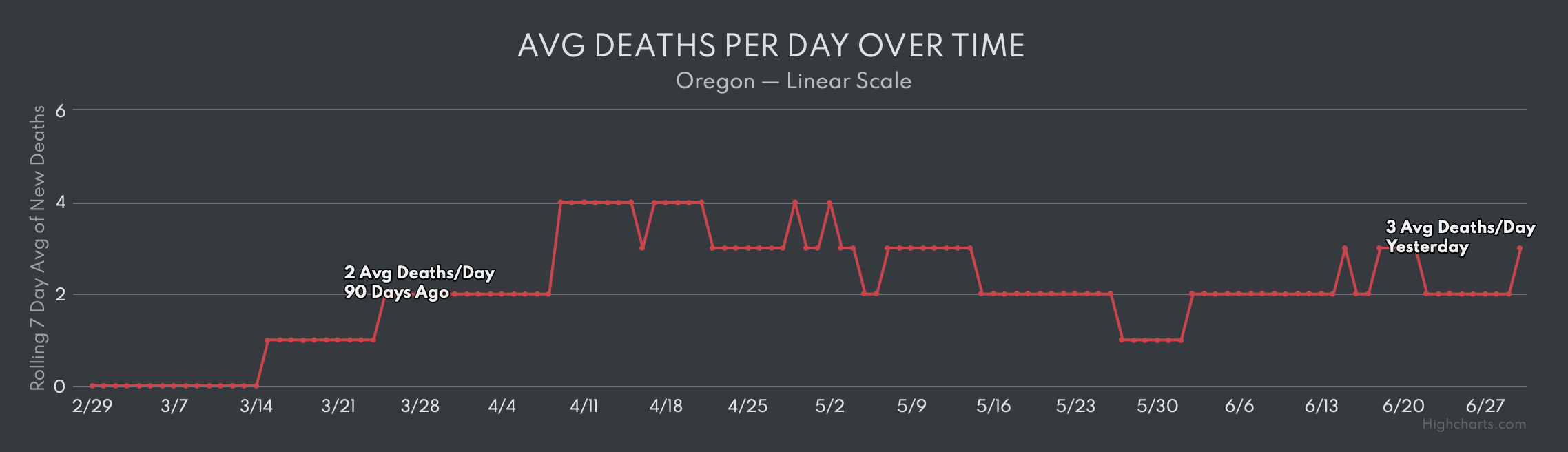
And, I need to make a point about this graph. It’s imperfect, it shows an AVERAGE of deaths per day. The truth is, we have had many days with ZERO deaths. Said differently, COVID-19 is a non-event here in Oregon, the peak was back in mid-March, and the recent panic is incomprehensible and maddening.
Author’s note: I tried to be brief here. If you’d like more lengthy analysis, check out my Lockdown Lunacy and Lockdown Lunacy 2.0 analysis. And, if you have a better chart of deaths in Oregon, send it to me!
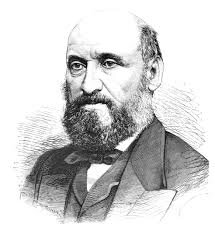
William Farr
About the author: J.B. Handley is the best-selling author of How to End the Autism Epidemic. He graduated with honors from Stanford University, and currently serves as a Managing member of Bochi Investments, a private investment firm. He can be reached at jbhandleyblog@gmail.com