
This is what we screwed the world for
Fri 11:14 am +01:00, 26 Jun 2020
So I have taken the ONS’s annual death figures for England and Wales and graphed them all the way back to the turn of the twentieth century. Then I thought: what if we presumed that the death toll for 2020 is the five-year average plus the Covid-19 numbers? This is likely to be a high estimate, as probably many of the people who died from Covid-19 would have died this year anyway, so the real annual total is not likely to be that high. But I thought, let’s see what that number would look like anyway.
(I’m presuming that lockdown has saved none or few lives, which has been shown by numerous comparisons between countries, including Sweden, which all have the same curves. Note also that there is the complication that lockdown may itself inflate the death toll for 2020, via things like delayed cancer treatments, but any such deaths should not be in my graph anyway, as they are deaths caused by the lockdown, not Covid, and I’m trying to show the effect of Covid.)
The five year average for 2015-19 is 531,355 deaths per year. As of writing this there were 42,462 Covid-19 deaths in the UK (from this site). There are likely to be a few more deaths in the next few weeks, but not many more, as the disease is (barring an unlikely second wave in winter), almost gone. Besides, the number we are adding on here is for the whole of the UK, not just England and Wales, so if anything this number is inflated. Adding the two numbers gives us an estimated 573,817 deaths for 2020. I put that into the spreadsheet and graphed the numbers back to 1900. Here is the result, with time running right to left, so the 2020 estimate is on the left-hand side. (Click to enlarge.)
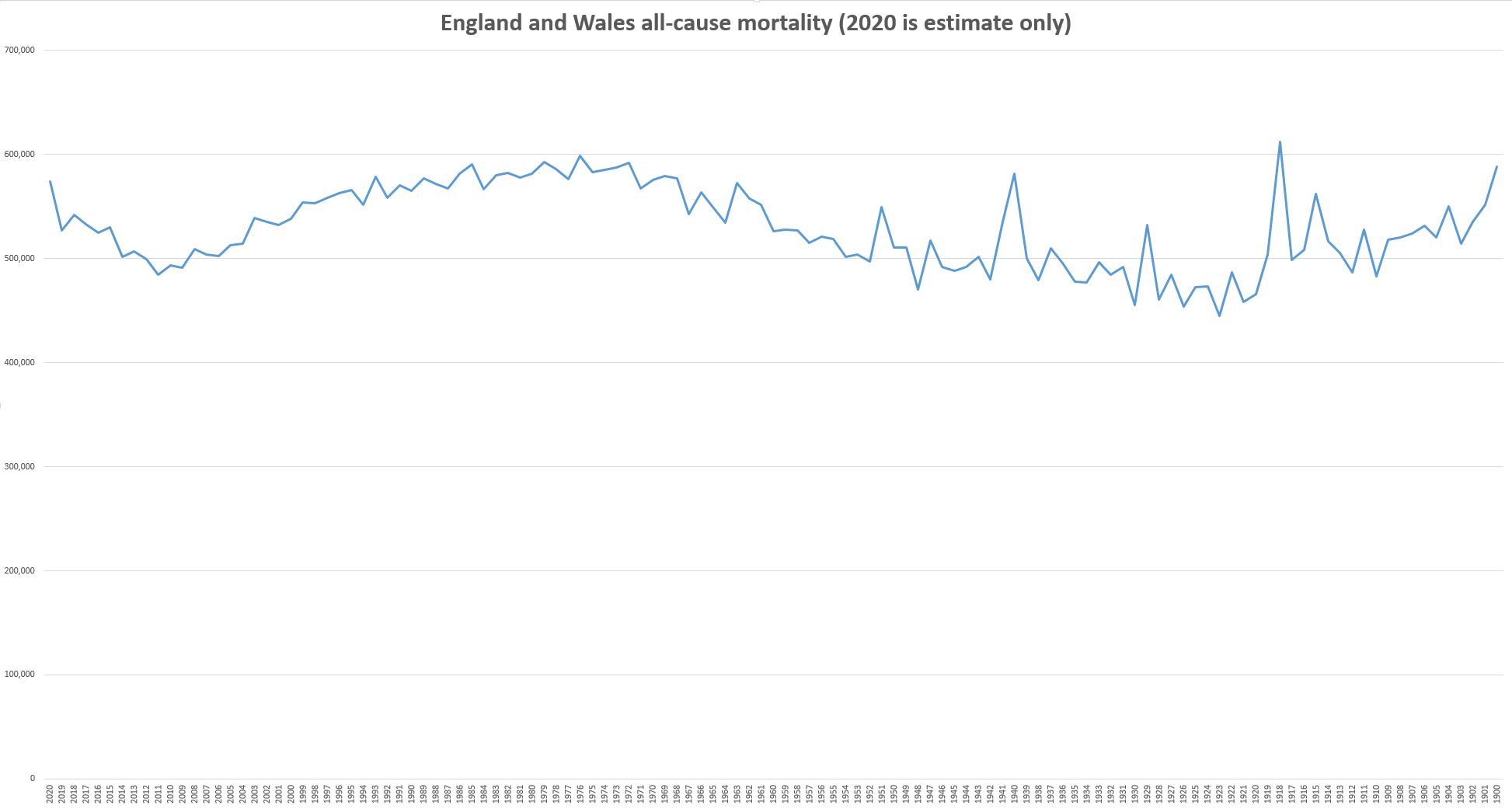
So: no gigantic, bowel-emptying spike in 2020. No jaw-dropping upwards vertical spike to match those jaw-dropping downward vertical spikes we saw with the economic data. Nothing much at all, really. Ask someone in the future who was unacquainted with the era to point to where the once-in-a-century medical disaster was, and they would have no chance of picking it out.
For God’s sake, it’s not even as many as 1993, or 1989, 1986, 1985, 1983, 1982, and numerous other years.
And bear in mind that this graph IS NOT EVEN ADJUSTED FOR POPULATION GROWTH. I’m going to do that soon, and that will show a pronounced downward curve over time. 2020 won’t come anywhere near to comparing with other earlier eras. Far from being a once-in-a-century pandemic, Covid-19 turned out to be a bad flu. We shut down the world for a bad flu. We shut down the world despite living in the safest era in the whole of history.
Update: I have been spending a lot of time digging into the excess winter deaths situation, and I’ve become less convinced that it’s a useful way of looking at things (post coming soon), but it doesn’t really matter when you look at the graph above.
A plea: Please support my work here and on Twitter and Patreon by sending a donation my way via Ko-fi, or taking out a Patreon subscription (links on the right-hand side). Also please buy my book!