Alistair Haimes: The virus that turned up late
Fri 12:12 pm +01:00, 29 May 2020
This is an article by Alistair Haimes, who has worked with data professionally for 25 years. Alistair has recently published two articles in the Critic magazine.
Covid-19 is no more than a nasty, but basically normal, viral respiratory infection, though you’ll be regarded rather as a mullah regards a blasphemer if you say so. Why is this?
After all: it is precisely because its symptoms seemed so similar to viral pneumonia that the initial outbreak in Wuhan was missed until the numbers built, and it is now clear that we have been missing Covid-19 cases diagnosed as pneumonia in Europe at least as far back as December, probably earlier. In the vernacular: it looks as though it was bubbling away for ages before we noticed.
But if this is really the killer that has forced the biggest suspension of civil liberties since Oliver Cromwell’s Protectorate, what is so unusual about it? Where are the Emperor’s clothes?
Given that my daughter is having a tap-dancing lesson on Zoom in the neighbouring room as I type, one obvious difference is that we declared lockdown for this but for no previous killer disease; but rewinding, what is so unusual about the virus that produces the disease that provoked the lockdown?
The clue is right under our noses. Let me play a latter-day Poirot.
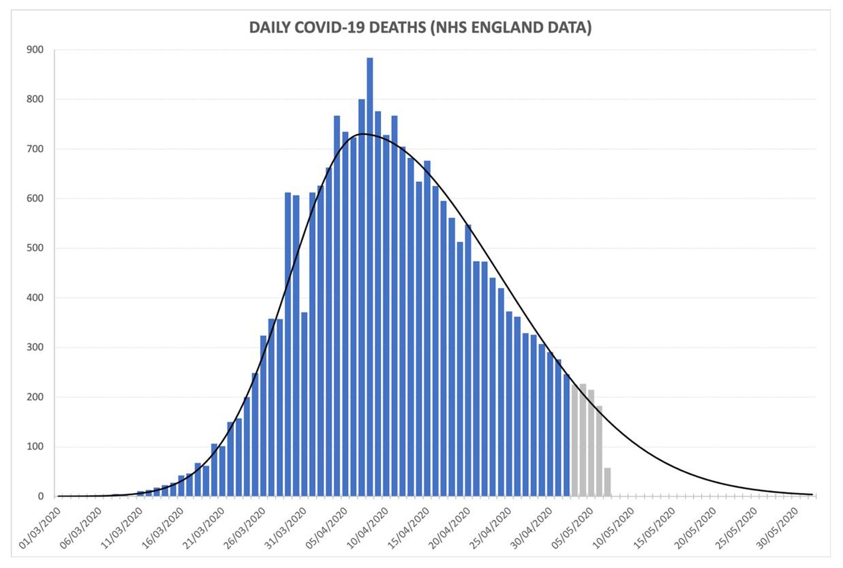
Below is a graph showing the numbers of Covid-19 patients who have died each day in NHS hospitals in England (clickable larger version at end of article):

The shape is textbook normal – and I mean ‘normal’ mathematically: as in, it’s an epidemic bell curve, and it’s a great ‘fit’. Forget trying to spot the hockey-stick impact of lockdown: this curve is basically identical to Free Sweden’s; and if the lockdown hypothesis were true, Stockholm would by now be a morgue and Greater Tokyo (population 38 million) a necropolis. (When I complain about people fearfully embracing their incarceration I can no longer even use the phrase ‘Stockholm Syndrome’, and that makes me angry.)
How about the numbers who succumb to the disease (the y-axis, i.e. the height of the bars)? Deaths per day, as is well-reported, peaked around Easter; and because deaths lag infections by something around three weeks, this implies that infections peaked sometime in mid-March. If you add up all the bars in the chart and fill in the blank area of deaths still to come, we are looking at a killer that, in scale, is bad-but-nothing-special compared to killers of previous years. Panning out: as a killer worldwide, it looks as though Covid is going to take a toll perhaps 1% of 1918’s Spanish Flu.
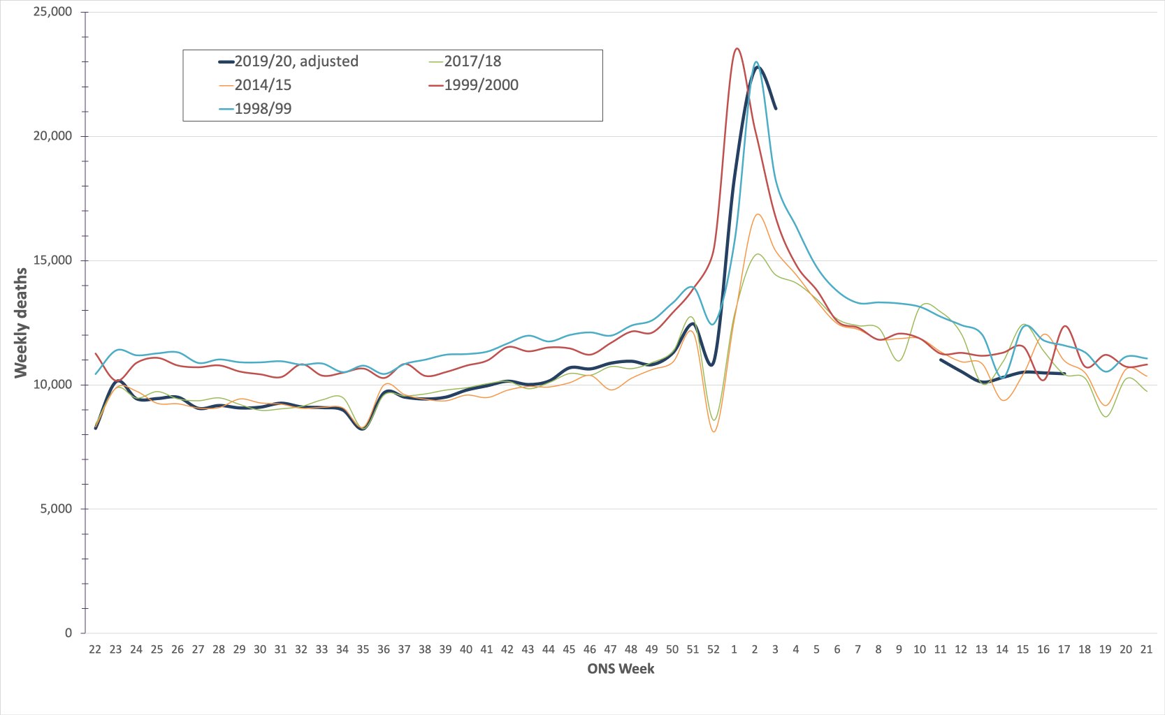
So what’s so unusual? Actually, look again: the clue is in the dates running along the bottom of the graph, showing that deaths peaked on 8th April. Deaths followed a regular path up to that date, and are following a regular path down again; but the middle of the bell-curve is just before Easter.
And that really is unusual – very unusual. At least as far back as I can find reliable data (about 1990), seasonal epidemics always strike slap-bang in mid-winter, not in spring.
Is that all? Please: don’t tell me we’ve suspended civil liberties, shut our schools and put our economy into a coma just because it’s turned up later than these germs normally do? Have we honestly moved 8 million people (and counting) onto the government’s payroll over a virus that has done little more than miss its train?
Let’s have a look. It is actually possible to re-write history and, roughly, see how the epidemic would look if it had struck in mid-winter rather than spring. Here’s the spadework:
The Office for National Statistics (ONS) publishes weekly all-cause mortality (i.e. death) figures for England and Wales, at least back to the early nineties. Since the start of the epidemic, they have also published weekly numbers of people dying with Covid-19 mentioned on death certificates, and they also publish 5-year average numbers of deaths per week, which 2020 was following until Covid-19 came along. So, you can work out excess deaths during the epidemic (i.e. weekly deaths minus 5-year average deaths), and, if in turn you subtract the Covid-19 deaths from this excess figure, you get to what the CMO Chris Whitty calls the “indirect deaths” associated with the epidemic, largely through missed A&E admissions (largely cardiac) and, later, through missed referrals (largely cancer).
Once you have these numbers, it’s simple. Firstly, subtract Covid-19 deaths from March/April and just add them to December 2019/January 2020. Secondly, remove indirect non-Covid excess deaths (‘lockdown deaths’, if you like) from March and April, on the basis that life would have gone on as normal with no lockdown under our imagined scenario, so no missed admissions or referrals. We’re simulating a situation where Covid-19 appeared in mid-winter but life went on as normal.
Two final adjustments: sorry, I said this would be simple, but we’re nearly there. The ONS also publish population figures each year, so in order to compare Covid-19 with previous killer germs you can inflate previous years so that you are comparing ‘apples with apples’. Finally, to make the graph more legible, I have also played the medieval pope and shifted the months so that mid-winter is in the middle of the graph.
So: the dark blue line is 2019-20, with Covid-19; the turquoise and red lines are the bad flu years of 1998-99 and 1999-2000 (clickable larger version at end of article).
Awkward? It would be snarky to suggest that we should retrospectively classify the millennium celebrations as a super-spreader event, so I’ll simply point out that Covid-19 is narrowly in third place as a killer to remember, behind the 1998-99 and 1999-2000 influenzas (2017-18’s ‘Beast from the East’, the green line, doesn’t place), a point also made by American statistician William Briggs.
Hopefully the sage eggheads on SAGE have tried something similarly basic, given these are ONS figures and it took me about half an hour, but if so it’s slightly difficult to see why we are still locked down and why the media seem to have moved Covid-19 up a weight-class.
Thing is: how many of us do remember the winters of 1998-99 and 1999-2000 as being particularly bad flu seasons? I confess: I don’t, but there’s no ‘just’ flu about it: Covid-19 is a serious killer, and so is influenza. One viral disease we seem to have in perspective; the other not so much.
There are really only two particularly unusual things about the Covid-19 epidemic: the timing of its arrival and the lockdown some countries declared. And if we ask “Covid, where is thy sting?”, it is lockdown that will sting: in the UK, the death-toll of people not turning up to hospital with cardiac issues (admissions are down 50% across the country) is now unmissable in the weekly non-Covid excess death figures published by the ONS, now running over 3,000 per week just for England and Wales. The downstream toll from missed cancer diagnoses (referrals are down 67%, as stressed by Professor Sikora) is heartbreak yet to come.
This is to say nothing of the toll on education, liberty and the economy. We’ve given up everything we should hold dear for a virus that just turned up three months later than similar viruses normally do
- https://hectordrummond.com/2020/05/09/alistair-haimes-the-virus-that-turned-up-late/