Where Did SAGE Get 4,000 Deaths a Day?
Mon 9:43 am +00:00, 2 Nov 2020
Spectator editor Fraser Nelson wrote a terrific blog post on Saturday evening, querying where SAGE got its 4,000 deaths-a-day figure from. Remember, it was this modelling that frightened Boris into abandoning his ‘middle path’ strategy in favour of a second lockdown.
Just 10 days ago, Boris Johnson was attacking lockdowns for the “psychological, the emotional damage” they inflict: the effect on mental health as well as the economy. Then, he saw COVID-19 as a menace that could be managed with a “commonsensical approach” of local and regional measures. Now, he sees Covid as a monster capable of overwhelming the NHS and warns of a “medical and a moral disaster” if we do not do a stay-at-home lockdown. His view of the virus seems to have changed, utterly. Why?
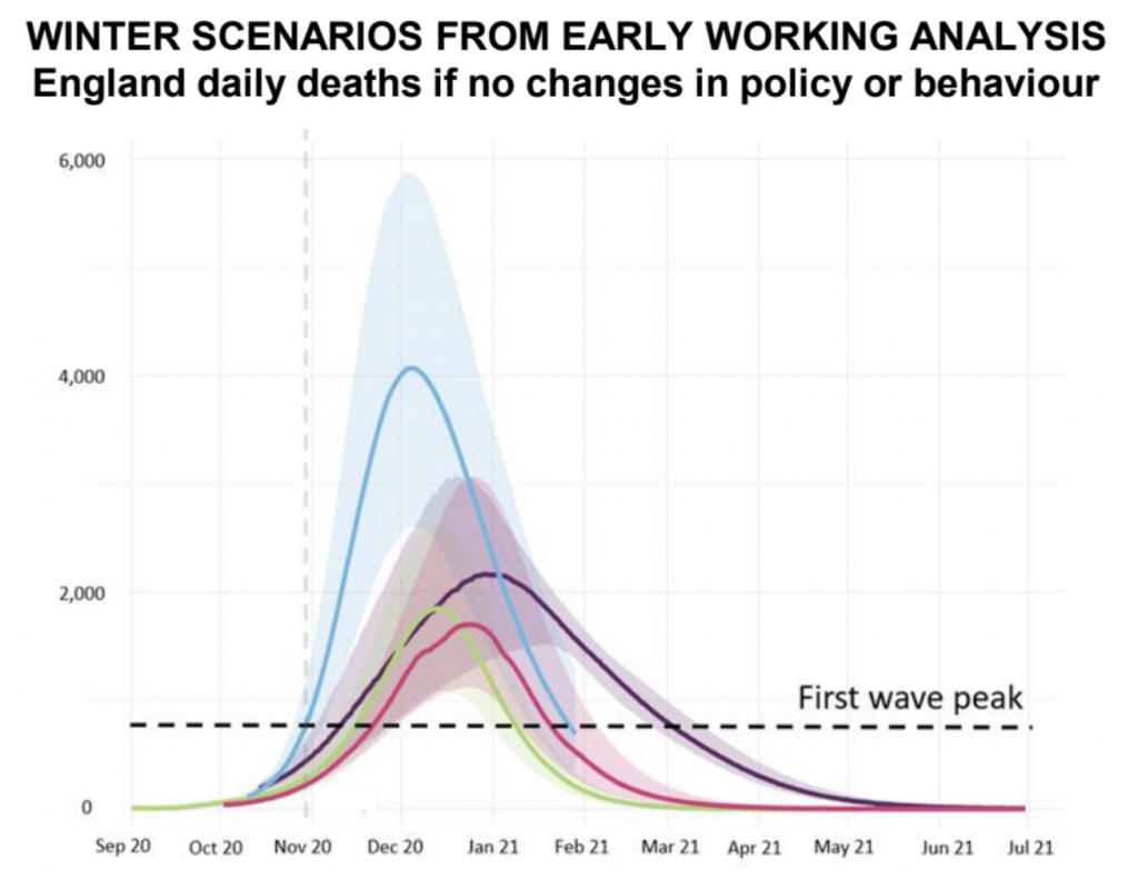
As soon as he started his statement, he turned to the graphs on which his case hangs. It was not so much new data, but new models showing new forecasts. Sir Patrick Vallance, the Chief Scientific Officer, ran through them: the same ones leaked to the BBC a few hours earlier. As we know, the first wave peaked at just over 1,000 daily deaths. The new graphs show deaths hitting 4,000 deaths a day – perhaps even as high as 6,000. To put this in perspective, daily deaths in the USA peaked at about 2,500. If 4,000 daily deaths is now plausible from a second wave in Britain, as the models seem to suggest, drastic action is understandable. Here is the graph, shown at the press conference, that makes the case for lockdown:

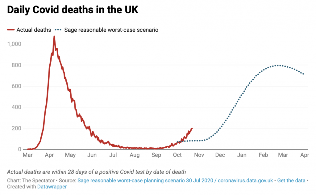
The above graph is quite a departure from previous understanding of Covid’s potency. We now see second-wave deaths dwarfing not only those from the first wave but those envisaged by the Government’s official ‘realistic worst-case scenario’ (RWC) for the coming winter. The RWC was a secret until the Spectator published it a few days ago, showing deaths peaking at about 800 a day. Here it is.

When we printed the above chart, it looked bad enough. Now it looks tame by comparison of the new studies. And there’s no mention of ‘worst-case’ scenarios: these are billed only as ‘winter scenarios’. But who drew them up? What are the assumptions? And how robust are they? The leak this morning told us who did the modelling: Cambridge, Imperial, etc. Just as an Imperial study made the case for the first lockdown, these four studies make the case for the second. So they ought to be published, together with the assumptions behind them. It would help explain how we get from the data we’ve seen in recent weeks to the scenarios shown to us now, which suggest a tsunami.
Fraser is quite right. If the Government is going to rely on these models to justify placing the whole of England under virtual house arrest for at least a month and almost certainly longer, it is surely under an obligation to publish them? Not just so they can be scrutinised by the electorate, but also by other scientists and – critically – Conservative MPs who will be expected to vote for the second lockdown on Wednesday.
Ross Clark, writing in yesterday’s Telegraph, cast doubt on the reliability of the models used in Saturday’s briefing.
Who noticed the small print at the bottom of the graph, illegible on the version flashed before us during the press briefing but visible in the slides published online: “these are scenarios – not predictions or forecasts”? Oddly, there was no source listed for these graphs – we were told only that they come “from a number of academic modelling groups”. We have subsequently learned that the most frightening curve – the 4,000 a day one – was the work of Public Health England (PHE) and Cambridge University. But it does not seem to have been published – and my efforts to extract the study from PHE have so far drawn a blank. Without being able to see its workings, we have no idea what assumptions have gone into the 4,000 deaths a day claim.
It certainly doesn’t pass the smell test. On Saturday, Public Health England reported 278 new Covid deaths in England. The average number of deaths for the past seven days is 214, up 50 per cent on the week before. If deaths kept on rising at that rate then, yes, you would get to 4,000 deaths a day in December.
However, a better guide to future deaths is the figures for new infections, which, of course, tend to lead the death figures. Over the past seven days PHE has recorded an average of 22,521 new cases a day – which was a six per cent increase on the week before. If deaths follow the trajectory of new infections – as surely they must, unless COVID-19 suddenly mutates into a vastly more deadly form – they will be nowhere near 1,000 a day by Christmas, let alone 4,000.
The figures for new infections clearly show a slowdown in the increase in new infections. But you wouldn’t have gained this impression listening to Professor Chris Whitty or Sir Patrick Vallance on Saturday. Whitty tried to tell us that infections are rising in every part of England – in spite of a graph on the screen clearly suggesting they have begun to fall in the North East. The graphs also indicated a levelling off of new infections in London, the South East and the West Midlands, and low trajectories in the East and South West. Only in the North West and Yorkshire and the Humber are infections following a really worrying curve. Parts of these regions have recently been subjected to Tier 3 restrictions, which are not now going to be allowed time to work.
Instead, exactly as Boris Johnson told us a week ago would be misguided, we are going to close down restaurants in Cornwall to try to fight an epidemic in Manchester. As in the spring, the Government has allowed itself to be panicked by alarmist modelling, a worst-case scenario dressed up as if it were scientific fact – and this time we don’t even get to see the workings.
This is truly alarming. What assumptions have PHE and Cambridge University made in these apocalyptic models? And just how credible are they?
If anyone would like to leak these models to Lockdown Sceptics, we will get a crack team of top scientists to subject them to a quick-and-dirty peer review in time for Wednesday’s vote. Contact us here. Discretion assured.
Stop Press: Turns out, the projections produced by the Cambridge statistical unit that were invoked by Patrick Vallance at Saturday’s press briefings were out of date. According to the Telegraph, Vallance relied on a scenario that was drawn up three weeks ago rather than using a more-up-to-date scenario from the same unit that was far less apocalyptic.
The modelling presented on Saturday night, which suggests deaths could reach 4,000 a day by December, is so out-of-date that it suggests daily deaths are now around 1,000 a day.
In fact, the daily average for the last week is 260, with a figure of 162 yesterday.
And the statistics unit at Cambridge University has produced far more up-to-date projections, with far lower figures, the Telegraph can reveal.
These forecasts, dated October 28 – three days before the Downing Street announcement – far more closely track the current situation, forecasting 240 daily deaths by next week, and around 500 later this month.
While these predictions do not look as far ahead as December, they suggest a picture which is far more optimistic than the scenario which caused shock waves this weekend.
Prof Carl Heneghan, the director of the Centre for Evidence-Based Medicine, at Oxford University, said he was “deeply concerned” by the selection of data which were not based on the current reality.
He said: “Our job as scientists is to reflect the evidence and the uncertainties and to provide the latest estimates.”
“I cannot understand why they have used this data, when there are far more up-to-date forecasts from Cambridge that they could have accessed, which show something very different.”
Prof Heneghan said his analysis suggests the forecasts could be four to five times too high.
He said: “I’m deeply concerned about how the data is being presented so that politicians can make decisions. It is a fast-changing situation, which is very different in different regions, and it concerns me that MPs who are about to go to a vote are not getting the full picture.”
The Mail has done some digging of its own and also found out some worrying shortcomings in the data that featured so prominently at the Downing Street presser on Saturday night. For instance, the Cambridge forecast classified a death as being from Covid if it occurred within 60 days of a positive test result. It was precisely because the Covid death toll was being inflated in this way (as pointed out by Prof Carl Heneghan) that PHE reluctantly introduced the 28-day cut-off.
Was Boris aware that the Chief Scientific Officer and Chief Medical Officer were presenting him with out-of-date information when they leant on him to impose a full lockdown on Friday? The data presented by them in the Downing Street presser is looking more and more like the dodgy dossier that Alastair Campbell cooked up to justify the invasion of Iraq.
Worth reading in full.
Stop Press: A reader with a scientific background has summarised the REACT survey for us. You’ll recall, this was among the studies that scared the bejesus out Boris.
They take 85,971 self-administered swabs and analyse using our worst friend, the PCR.
They get 863 positives, which is 1%.
They then add a bit of ‘weight’ to it to make it 1.28%
THEN – get this! – they promptly ignore everyone who’s had it (probably 23 million based on an IFR of 0.2% and the deaths we’ve had) plus those who won’t get it because of T-cells, and multiply 1.28% by the entire population!
They then add a bit more ‘weight’ to the resulting 870,400 to make it 960,000 and then go ‘mmm… symptoms last about 10 days, so that must mean 96,000 cases a day!’
Shitty and Malice read it, report back to Prime Minister Lighthead (who at this stage I’m assuming can’t read himself unless it’s in Latin or Greek), everyone dumps in their pants and we’re off again.
Unbelievable. Utterly Un-make-up-able.
By
https://lockdownsceptics.org/


